UX Case Study · Healthcare SaaS · Ultramed

Clinical Notes

A clinical team documented the same patient record, but couldn't see who else was in it. Notes got overwritten and lost, with no audit trail and a real patient-safety risk. I rebuilt it alone over six months on a legacy backend that ruled out the obvious answer.

Role
Sole designer — research, UX, UI, prototyping
Domain
Pre-operative assessment software
Timeline
~6 months · now an MVP in active build
Team
Me on design · manager input · dev for feasibility
Tools
Figma · Claude Code (AI-native workflow)
Constraint
No design system · legacy form backend
5
end-to-end flows designed
1
designer, A to Z
01 — Context

A shared record for a whole clinical team

Ultramed builds the software UK hospitals use for pre-operative assessments: the checks a patient goes through before surgery. Patient answers land in a clinical portal where a multi-disciplinary team (nurses, pharmacists, clinicians, anaesthetists) works each assessment.

Clinical Notes is where that team documents its observations against a patient. It's shared and collaborative: several roles contribute to the same record, sometimes minutes apart.

Multiple trusts had flagged the module's limited functionality and the patient risk it created. The wider customer base felt the same problem.
02 — The problem

An unauditable form that lost people’s work

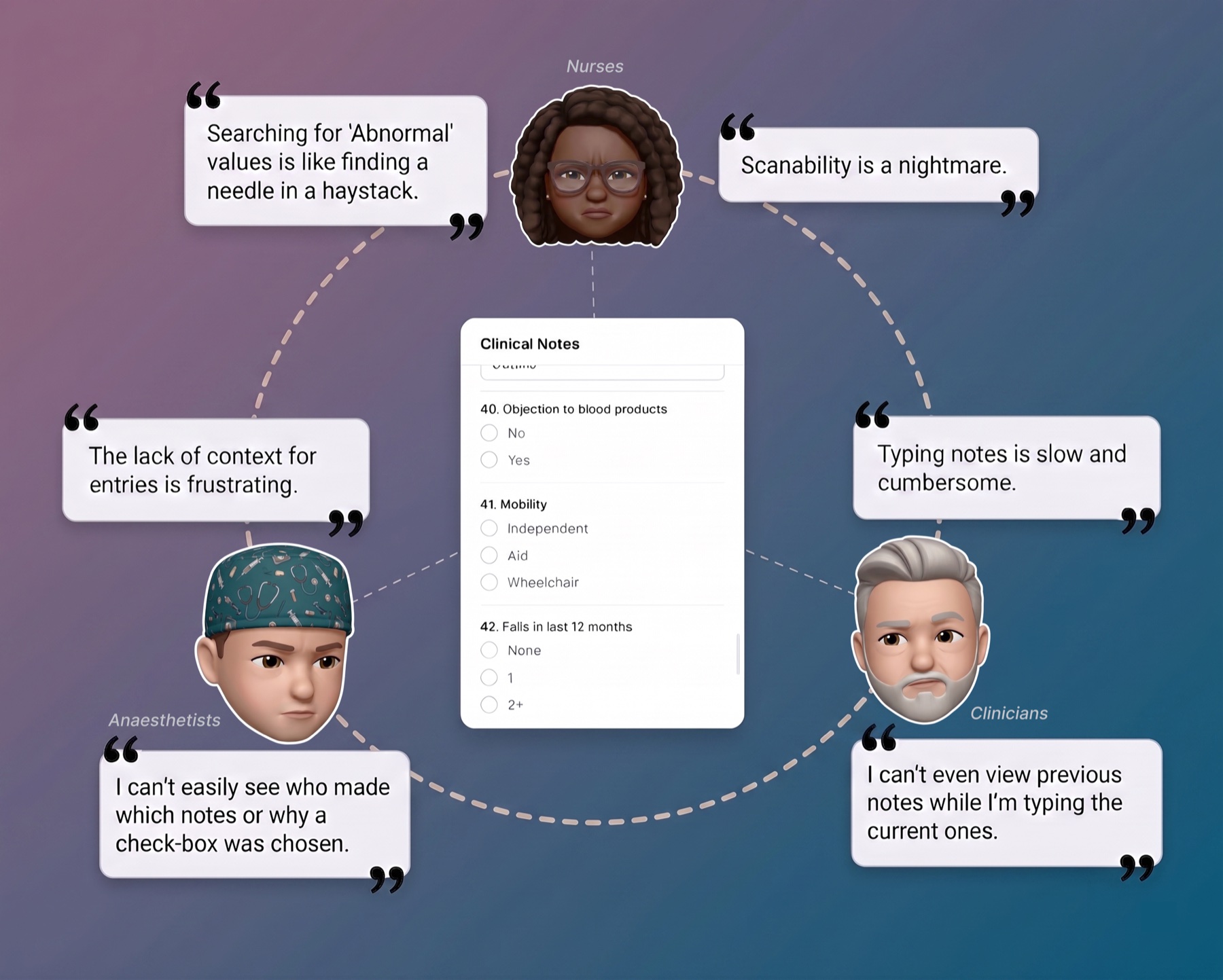
The old Clinical Notes was a simple form (text fields, radios, multi-selects) wedged into the bottom of a narrow side rail. Anyone could add, edit, or delete an answer, and there was no history and no audit trail. For a record multiple clinical roles rely on, that gap is a clinical-safety problem.

Fig 01 · Before
Representative interface
Pre-Op Portal
Born 11-May-1962 · Bowel surgery
ExpectedAdd TCI dateAdd ASA grade
Summary
Assessment
Messaging
Forms
Pre-Op Questionnaire
Clinical Notes
Procedure
Heart rate
Blood pressure
Temperature
Edit
Clinical summary report
Before — the old Clinical Notes: a text-and-radio form crammed into a narrow side rail, with a single Edit button and no authorship, history, or audit.
The detail that says everything

Clinicians had started keeping their notes in a separate file and pasting them in. Hitting save locked the other person out and discarded their work. A shadow copy of clinical documentation, kept in a text file, is the clearest signal a tool is failing its users.

How I knew — discovery without analytics

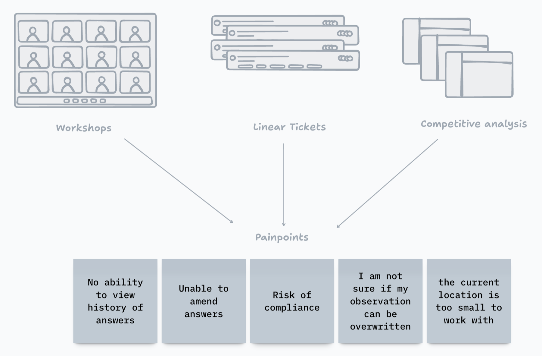
  1. Consolidated the complaints. Grouped Clinical Notes tickets in Linear and the steady stream of account-manager complaints into core problems.
  2. Validated with four trusts. Ran workshops mapping pain points, then used MoSCoW to sort requirements into must / should / could.
  3. Triangulated internally. Two sessions with in-house consulting clinicians, two with account managers, to cross-check what trusts reported.
Fig 02 · Discovery
Concept wireframe
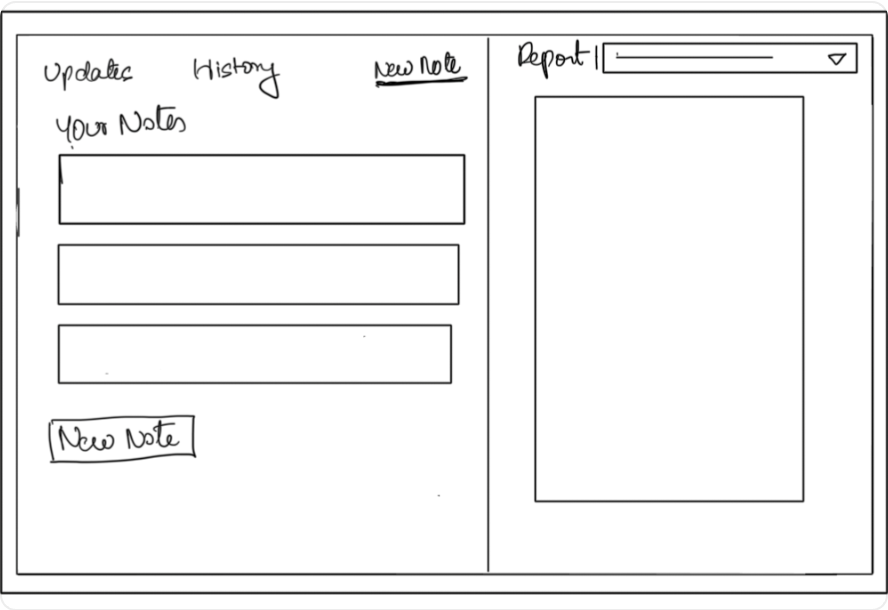
Updates · History · New Note · Report
List view
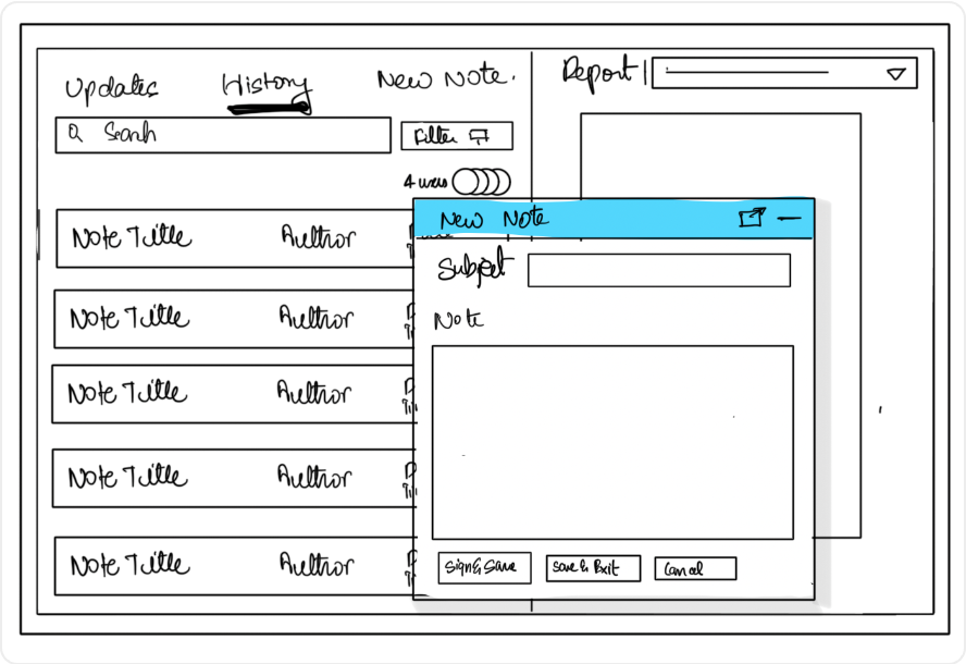
Floating note — explored, later cut
Save
Validated with trusts — the wireframe concepts shown in the workshops: the four-tab frame (Updates · History · New Note · Report) and the floating-window direction later cut for feasibility.
How might we let a clinical team contribute to the same assessment, without overwriting each other or losing the record of who changed what, on a legacy backend that can't support true real-time editing?

The second half is the real difficulty. The obvious answer to collaborative documentation is live co-editing. The backend made that impossible, so this became an interaction-design problem.

03 — Constraints

Why the obvious answer was off the table

These shaped every decision, and they're why the solution had to be inventive.

The reality I designed inside
  • A legacy form builder at the core. Everything, including Clinical Notes, is built as a form on top of it, which set hard limits on what could change.
  • No design system. Dev-first Tailwind, with three different "primary" blues across the product.
  • No UI designer. I owned all visual consistency from scratch.
  • Reuse, don't rebuild components, to protect a hard deadline.
  • No product analytics. No instrumentation of how users behaved.
So the design had to
  • Make collaboration feel safe and visible with no real-time backend.
  • Build an audit trail at the interaction layer, not in the database.
  • Fit the existing component set and ship on time.
  • Resolve visual inconsistency as part of the work, not as a separate project.
04 — Key decisions

Six calls that carried the design

Read the headlines for the whole story; read on for the why.

01

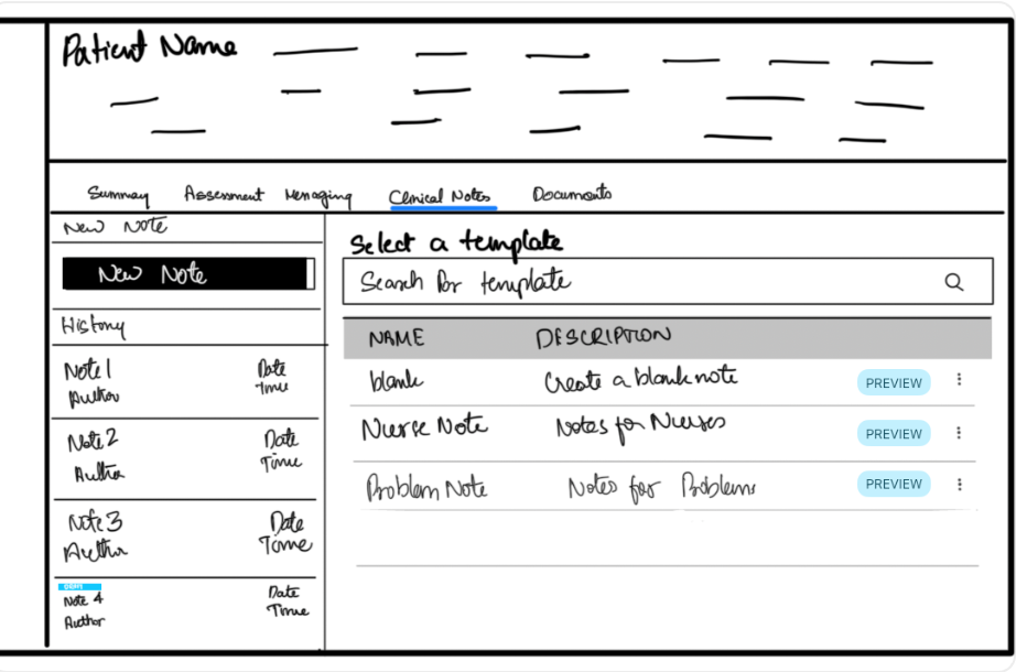
Split one long form into smaller, role-based templates

Each role works in its own template (Clinical Examination, Nurse Review, Anaesthetic Note). I couldn't stop clashes at the backend, so I reduced how often two people land on the same thing. The constraint shaped the structure.
02

Show every committed answer in place, with per-answer authorship

Answers render beneath the question and above the next input. Each carries a name, date, and time. No authorless answers, ever. Contributor visibility and history solved at the point of reading, not in a buried log.
03

Strikethrough-as-audit, with a forced reason — the headline

To amend, a clinician strikes the old answer through. It stays visible, with the new answer attributed beneath it, and a confirmation that requires a reason before it commits. The design captures who changed a record, what it was, when, and why. The original stays visible. The backend has no version history.
Clinical governanceNon-destructive
Fig 03 · Decision 03 in use
Representative interface
Updates
History
Clinical Examination
Report
Respiratory system
Normal — A. Rivera · 18 Jul, 11:25
Cardiovascular
No abnormality detected — A. Rivera · 18 Jul, 11:26
Strikethrough previous input
You're about to strike through a previous entry. This can't be undone. A reason is required.
Reason
CancelStrikethrough
Amending an answer forces a reason before it commits; the original stays struck-through and visible — an audit trail built at the interaction layer.
04

Awareness-based concurrency — soft by design, not just by constraint

Enter a note someone's editing, you're warned, then a persistent banner keeps you aware. Someone publishes while you write, you're told and prompted to refresh, because their finding might change your clinical judgment. Nothing hard-locks anyone. The backend couldn't, and clinical workflow shouldn't. A clinician may have a narrow window and can't be blocked from documenting.
Backend can't lockWorkflow shouldn't
05

The hardest case: cascading conditional invalidation

Some questions only exist because of a parent answer. When the parent is amended, the children are orphaned — and you can't silently delete them without destroying the audit trail. I converged on a unified amendment block: the parent strikethrough and every invalidated child live in one container — one audit event — each kept visible, attributed, and timestamped.
Stress-tested in code
Fig 04 · Decision 05
Representative interface
Does the patient have cardiovascular history?
Yes — A. Rivera · 18 Jul, 11:25
On review, no cardiac history confirmed; prior entry based on outdated notes.
No — A. Rivera · 20 Jul, 09:00
⊘ Other invalidated answers (4)
Hypertension status
Controlled — 18 Jul, 11:26
Coronary artery disease
Stable angina — 18 Jul, 11:26
Cardiac medications
Bisoprolol, Atorvastatin — 18 Jul, 11:27
Respiratory history
No known issues — A. Rivera · 18 Jul, 11:28
One audit event, one container — a parent change and every answer it invalidates kept together, each still attributed and timestamped, with a collapse for long lists.
06

A side-by-side View Report panel

Notes take ~50% of the window; a control opens the other half as a document viewport with a dropdown to choose what to reference. Clinicians read source data and write observations on one screen.
05 — The method

One pattern, every time

Across the project the same move recurs: every time I reached for richer, real-time interaction, feasibility said no — and I shipped the awareness-based fallback that preserved the core value. That consistency is the method: designing right at the edge of what's buildable.

Live avatars of who's editing
becomes
Soft concurrency warnings
A detachable floating window
becomes
The View Report split panel
Webhook-driven live sync
becomes
"New answers exist — refresh" prompt
06 — AI-native workflow

Exploring in code, before Figma

In the project's current phase I use Claude Code to generate component variations and stress-test them against messy real conditions (long answers, stacked strikethroughs, cascading invalidations) before committing anything to Figma. I find what survives the edge cases, then build the winner out. This moves validation earlier and cheaper. I catch layout and legibility failures in code before investing in polished frames.

Generate variations Stress-test edge cases Select survivor Figma Build

The cascading-invalidation block above came out of exactly this loop. I also built my own tooling to cover the missing design system: an HTML plugin that pulls live components from the test portal into Figma, so I rebuilt buttons and styling against what actually shipped. When the environment didn't give me a system, I engineered the bridge.

Fig 05 · AI-native workflow
Code exploration
Stress-test · amendment block under load
Long answer value that wraps across multiple lines to test legibility under realistic clinical input — 18 Jul
Amended value — 20 Jul
⊘ Invalidated (7)
…collapsed for length
Stacked strikethrough #2
Stacked strikethrough #3
Current — 21 Jul
tested: long values · multiple strikethroughs · cascading invalidation
Exploring in code before Figma — the amendment component pushed against long, messy answer chains and multiple invalidations to see what holds before any of it reached a polished frame.
07 — The solution

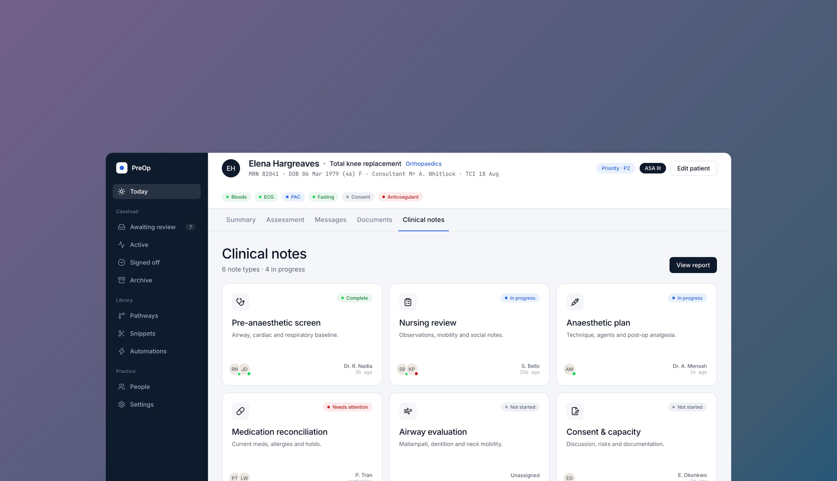
From a side-rail form to an auditable workspace

Fig 06 · After
Representative interface
Pre-Op Portal
Born 11-May-1962 · Bowel surgery
In progressASA IIIRTT 18 Jul
Updates
History
Clinical Notes
Report
Note templatesView report ▸
Clinical ExaminationAdd
Nurse ReviewAdd
Anaesthetic NoteAdd
Pharmacist NoteAdd
Neck & Airway AssessmentAdd
After — full-width, role-based note templates with a side-by-side View Report panel. The whole structure now leads with who's contributing what.
  • A dedicated, full-width Clinical Notes tab with role-based templates as the primary structure.
  • Every answer rendered in place, attributed and timestamped.
  • Non-destructive, reason-logged amendment via strikethrough — extended to cascading conditional changes.
  • Awareness-based concurrency from both sides — incoming editor warned and kept aware; active editor told when the record changes and prompted to refresh before finalising.
  • A side-by-side View Report panel so source documents and note-taking share one screen.

The flows in detail

08 — Impact

Honest, and still strong

The commercial driver fell away for reasons outside design, and the project paused. Worth stating, because it's outside what a designer controls: commercial priorities shift on procurement, timing, and politics. What I can speak to is whether the design solved the problem and held up. It did, on every axis that was mine to own.

It addressed a real patient-safety problem multiple trusts had flagged. It was validated and accepted. It entered development, with one slice built. It outlived its original driver.
  • Validated & accepted. Four trusts confirmed the direction; it cleared feasibility enough that development started and one slice shipped.
  • The work outlived its original driver. The finalised designs are now a live feature in sales demos to new prospects, and the project has been revived as the MVP in active development, generalised from one trust's needs to serve all trusts.

Design work that gets repurposed and revived after its original driver disappeared is, by definition, valuable. For a paused-then-revived project, that's the credible proof.

09 — Reflection

What it taught me

My first project with real constraints

Earlier work assumed developers could build anything in any timeframe. This taught me to design for the system and the deadline that exist.

MVP discipline was the biggest lesson

"These are great — now learn to cut down to what makes a deliverable MVP." I now categorise every feature as core-functional, cosmetic, or add-on, and defend the line.

Designing without a design system is far more work than it looks

Every reused component had to be found, understood, and adapted for consistency. As the only person doing UI, I held that together from scratch — and came out operating as UX, UI, and tooling at once.

What's still open

Template customisation: as trusts get multiple board templates to build their own notes, I want to learn how long those forms get in practice and whether everything still fits one coherent flow.

What's next

With the MVP back in development, I'm planning usability testing — using Claude Code to build functioning prototypes to test whether users genuinely understand the model before it ships. Validation is moving from directional buy-in to real testing.

Select any text to annotate
Copy this and paste it back into the chat