FoodFob
FoodFob quietly adds 10% to a student's café spend — yet only 5% of daily transactions used it. Students couldn't see their balance, kept forgetting the card, and most never knew it existed. I redesigned it as a mobile companion that makes the saving actually visible — researched, tested, and iterated in eight weeks.
A 10% saving almost nobody used
FoodFob is a Newcastle University initiative that tops up a student's café wallet by 10% to help them save on campus food and drink. As an MSc Human-Computer Interaction student, I was handed one at the café — and immediately hit friction trying to use it.
The premise is genuinely good: spend through FoodFob, get 10% more to spend. But the experience around it worked against the offer. This case study is my attempt to redesign that experience so more students actually benefit from it.
Good offer, invisible product
The FoodFob was a physical card students had to remember to carry and present at the till. There was no way to see your balance and no way to track spending. There wasn't a companion app at all — students fell back on generic third-party rewards apps that gave them nothing for using the FoodFob. For a money-saving tool, none of the saving was visible.
At the café till, only 5% of daily transactions went through FoodFob — and staff never asked whether you had one. A 10% discount that most students didn't know existed isn't a discount problem. It's a visibility and usability problem.
Validating it with real students
I needed to know whether other students felt the same friction. The university was already running focus groups on FoodFob usage, so I joined one as a participant — then ran my own contextual enquiries in the cafés.
How I dug in
- Joined a university focus group as a participant, validating the pain points I'd hit using the card myself.
- Ran contextual enquiries — observing students paying in the cafés and noting where the FoodFob slowed them down or got skipped entirely.
- Spoke to café staff and regular users. Staff confirmed FoodFob was ~5% of daily transactions; most students I asked didn't know it existed.
"I have no way to see my balance — I can't track my spending."
"I have to carry the card every time, and I keep forgetting it."
"The apps I use for points are totally generic — none of them do anything with the FoodFob."
Mapping the people and the journey
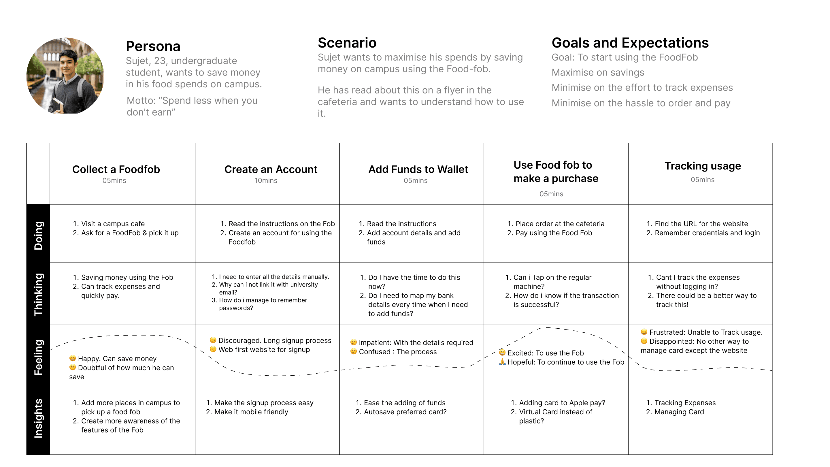
I identified the two key stakeholders — the baristas at the till and the students who used FoodFob regularly — and mapped how a purchase actually played out. Across a week of buying coffee, staff never prompted for the FoodFob unless I raised it first.
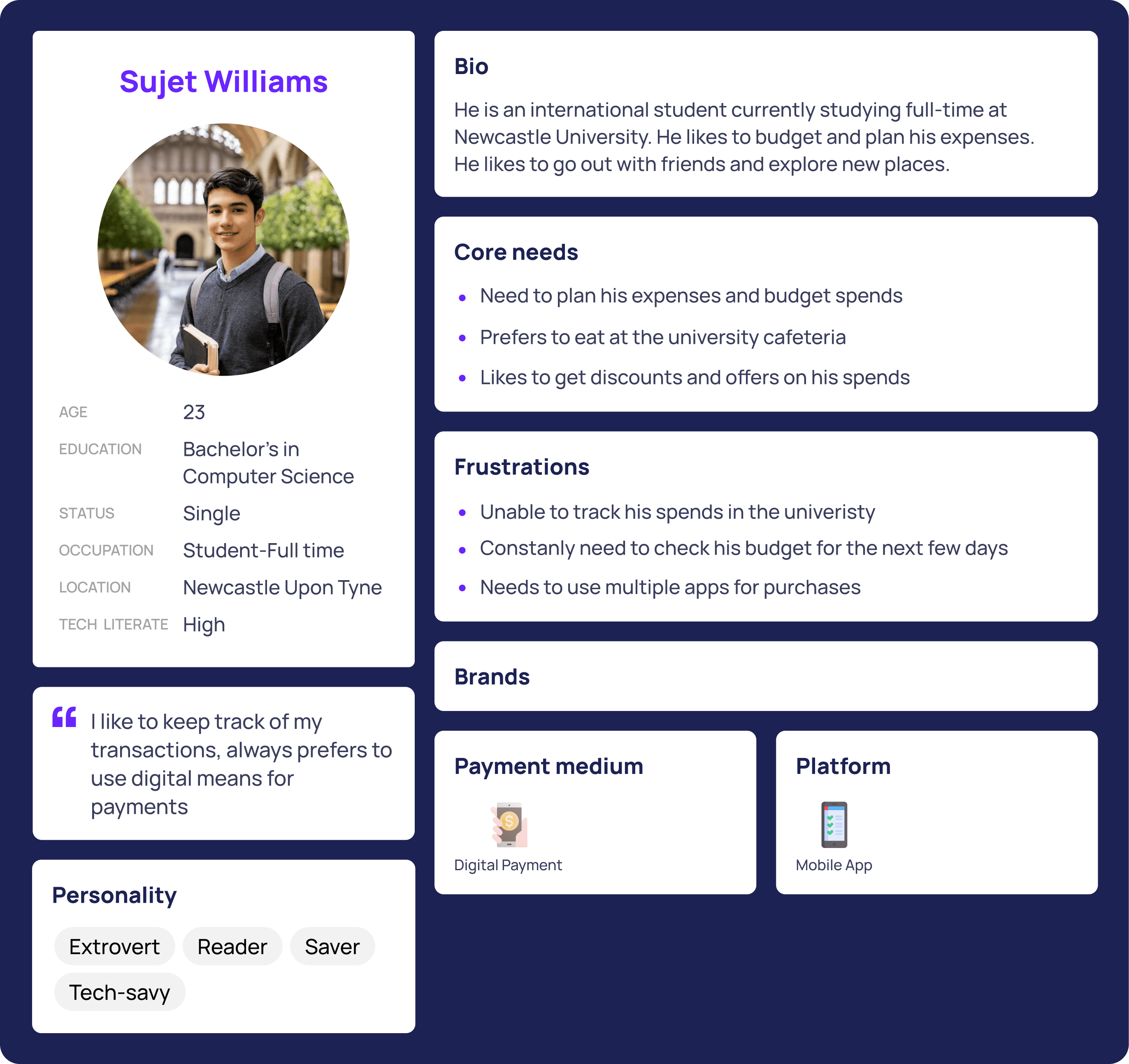
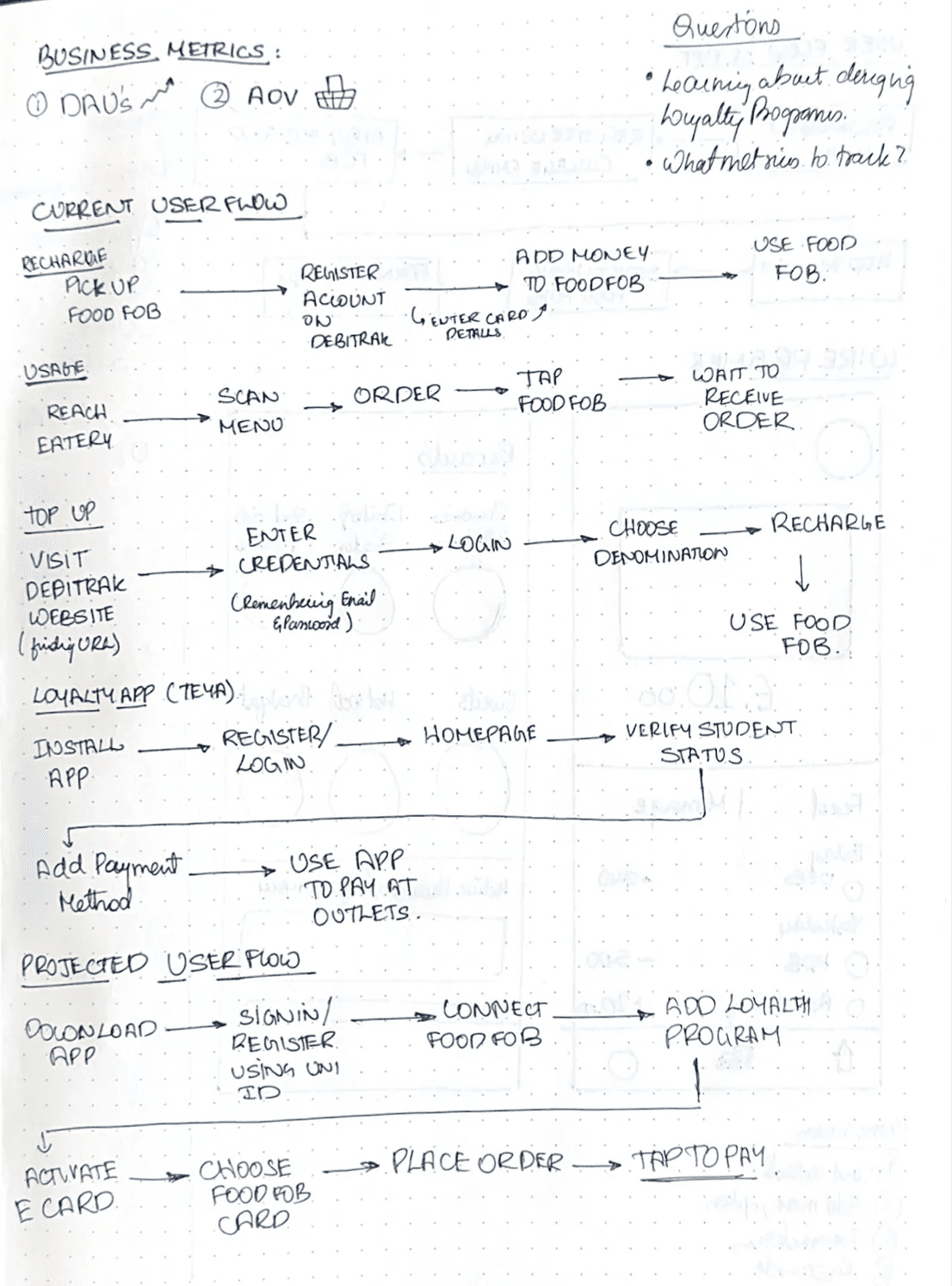
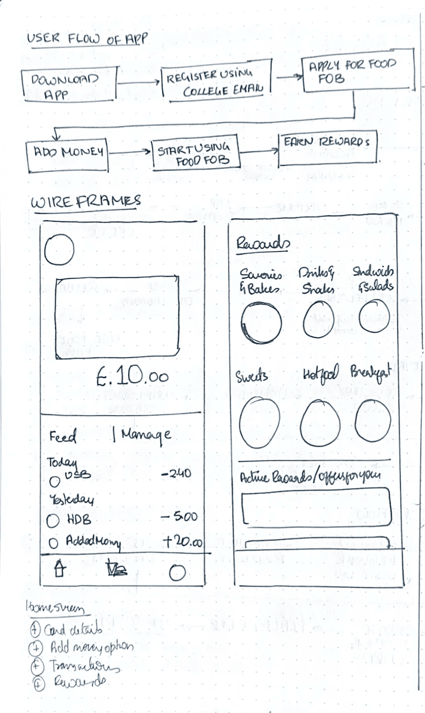
From those observations I built a persona, mapped the end-to-end journey, and sketched the first user flows and wireframes.
Three moves that made it worth carrying
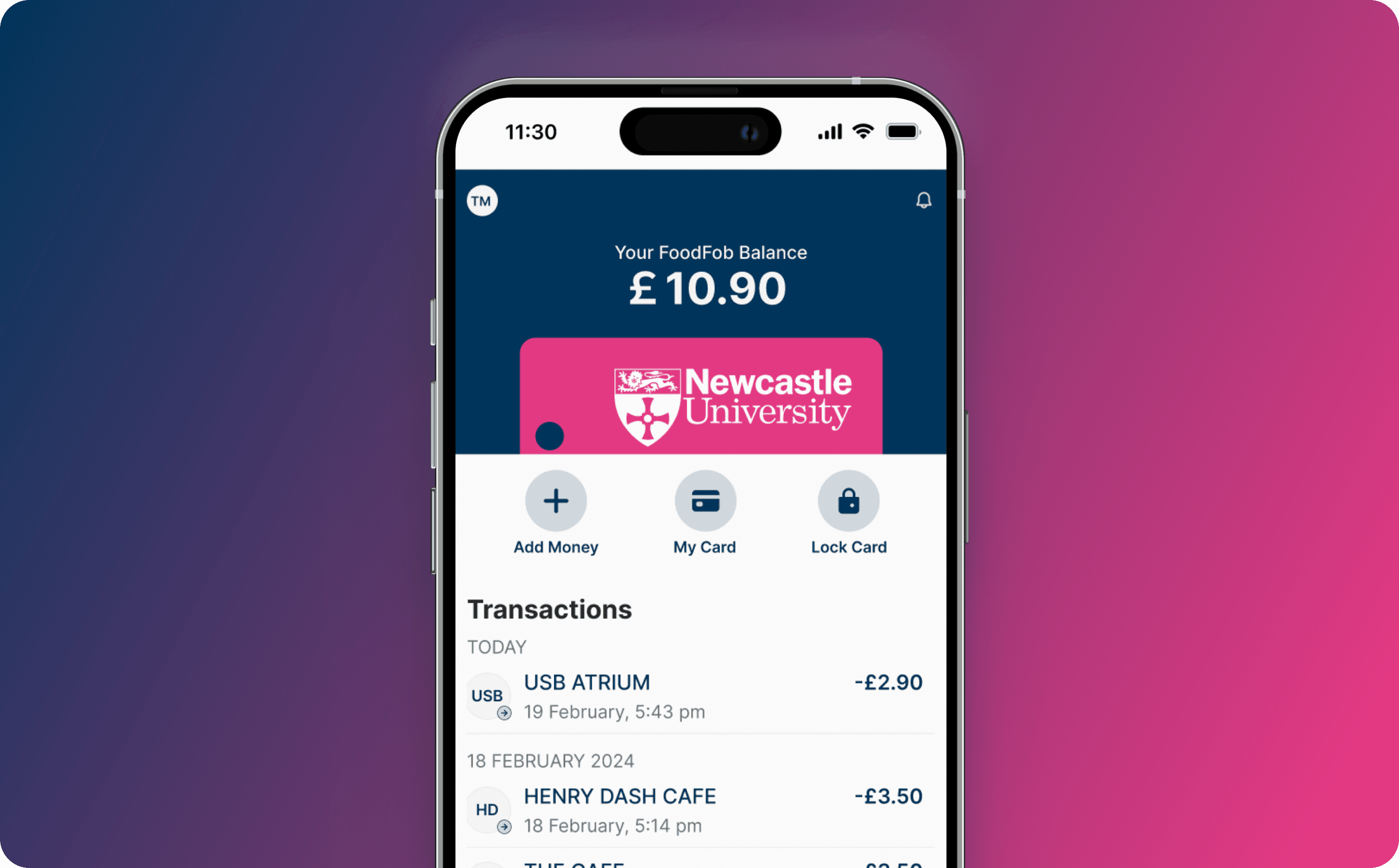
A mobile companion app for FoodFob
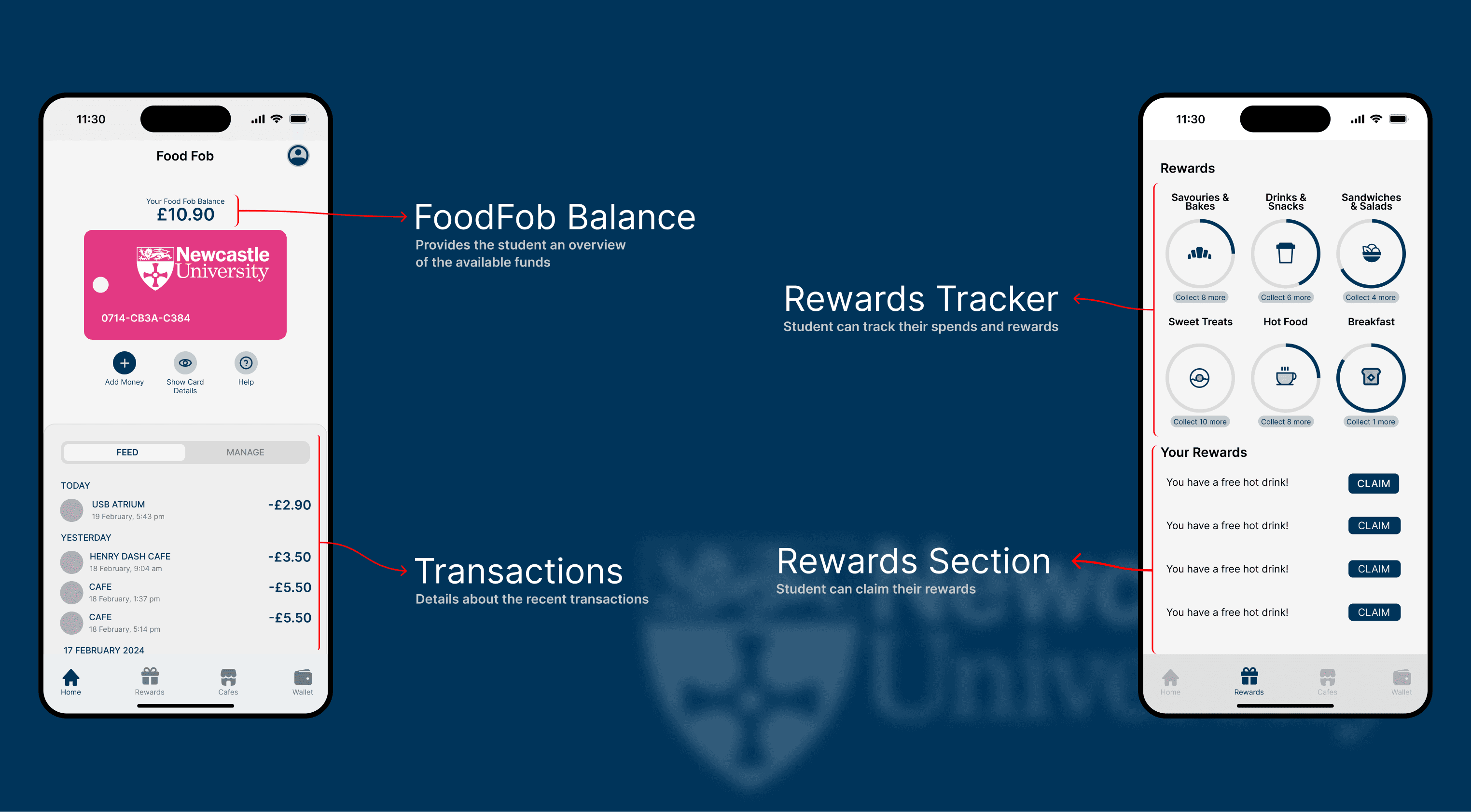
Rewards that earn daily active users
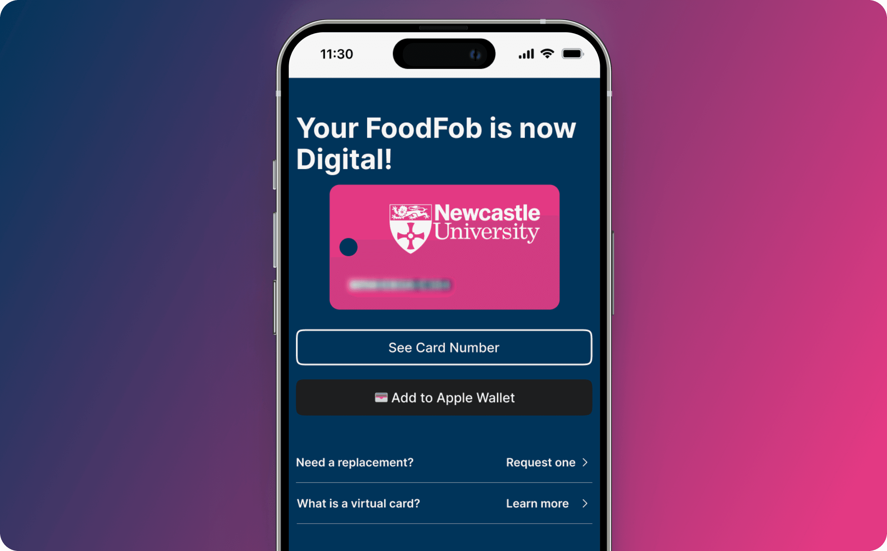
A digital FoodFob card
From wireframes to high fidelity
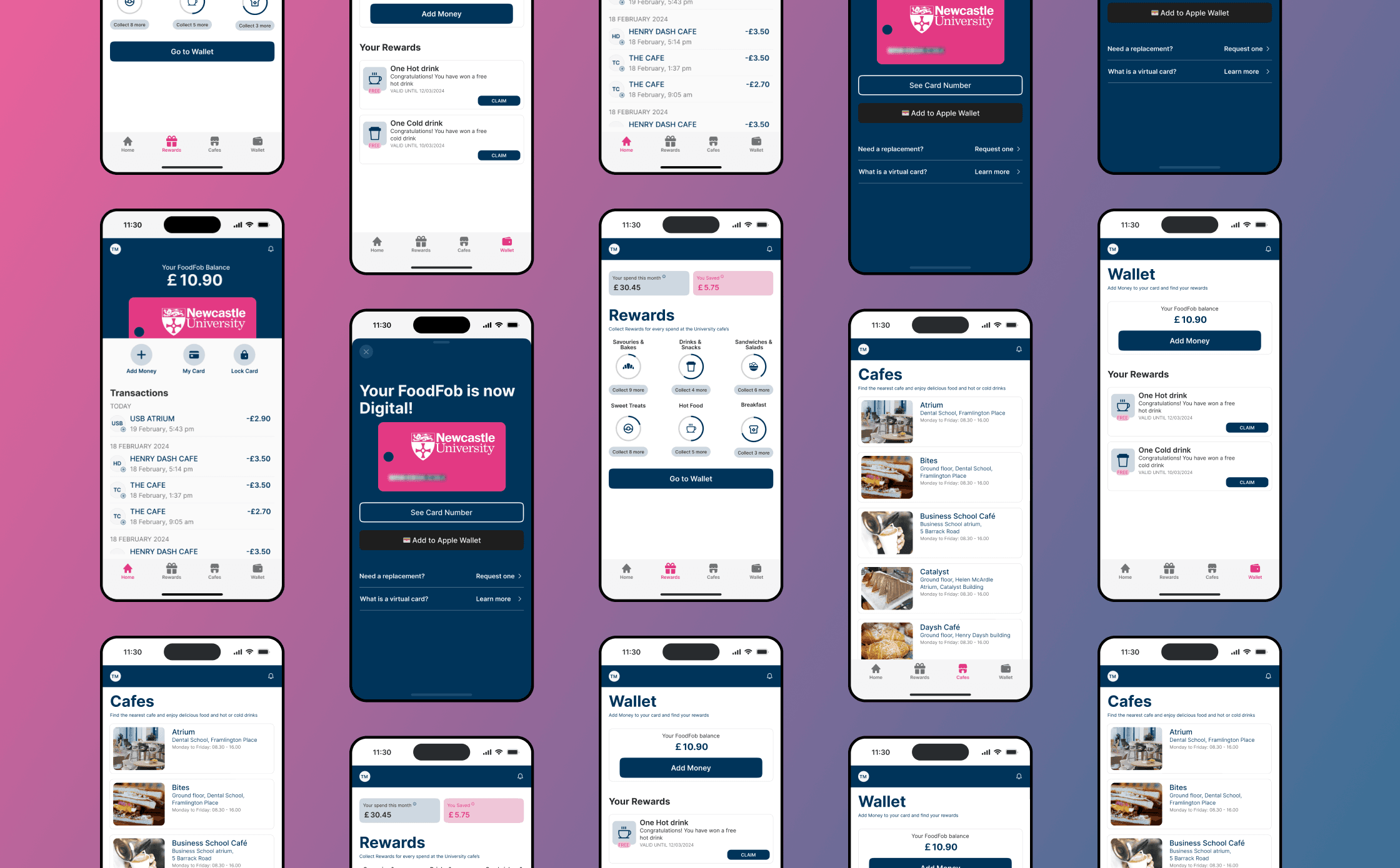
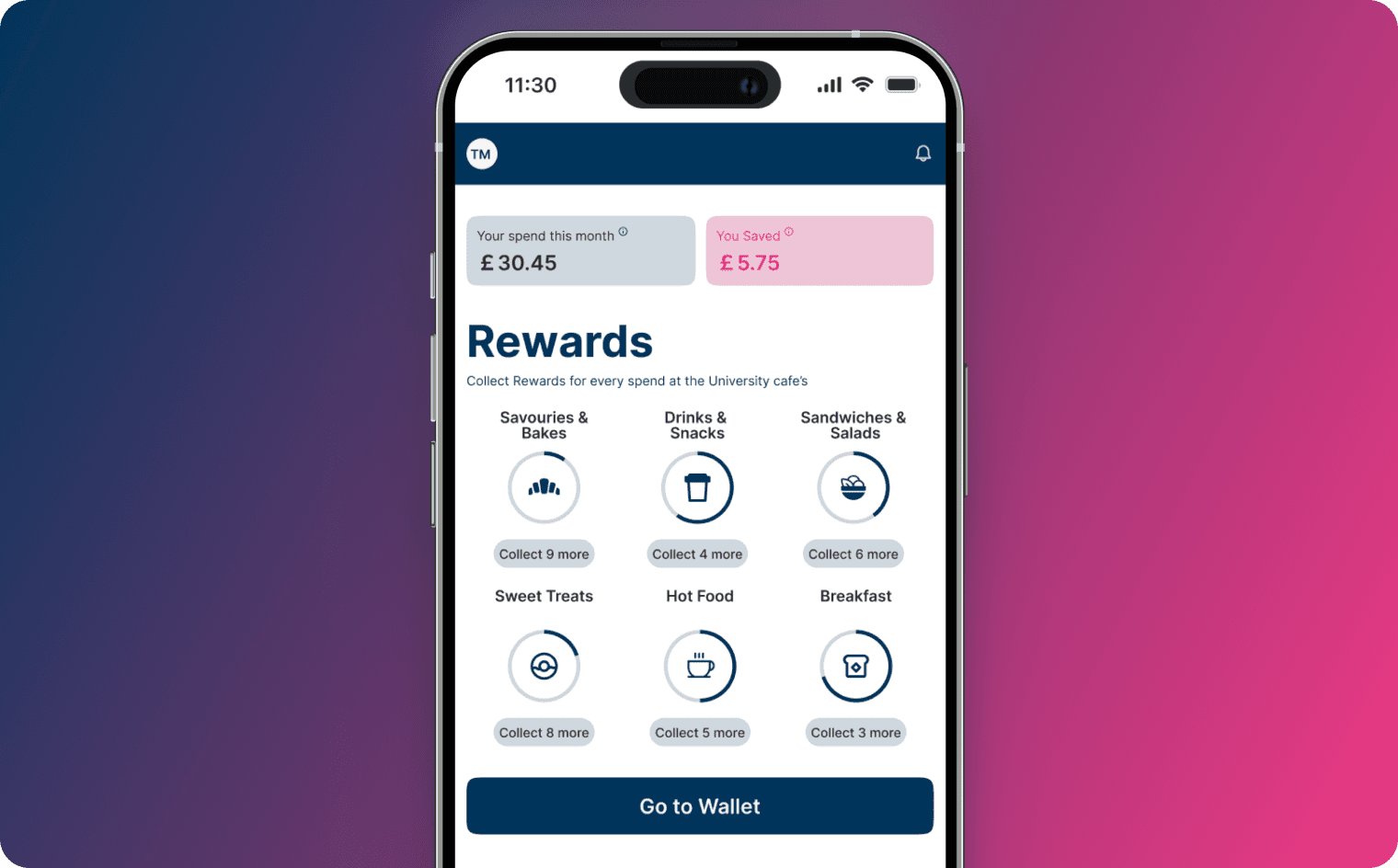
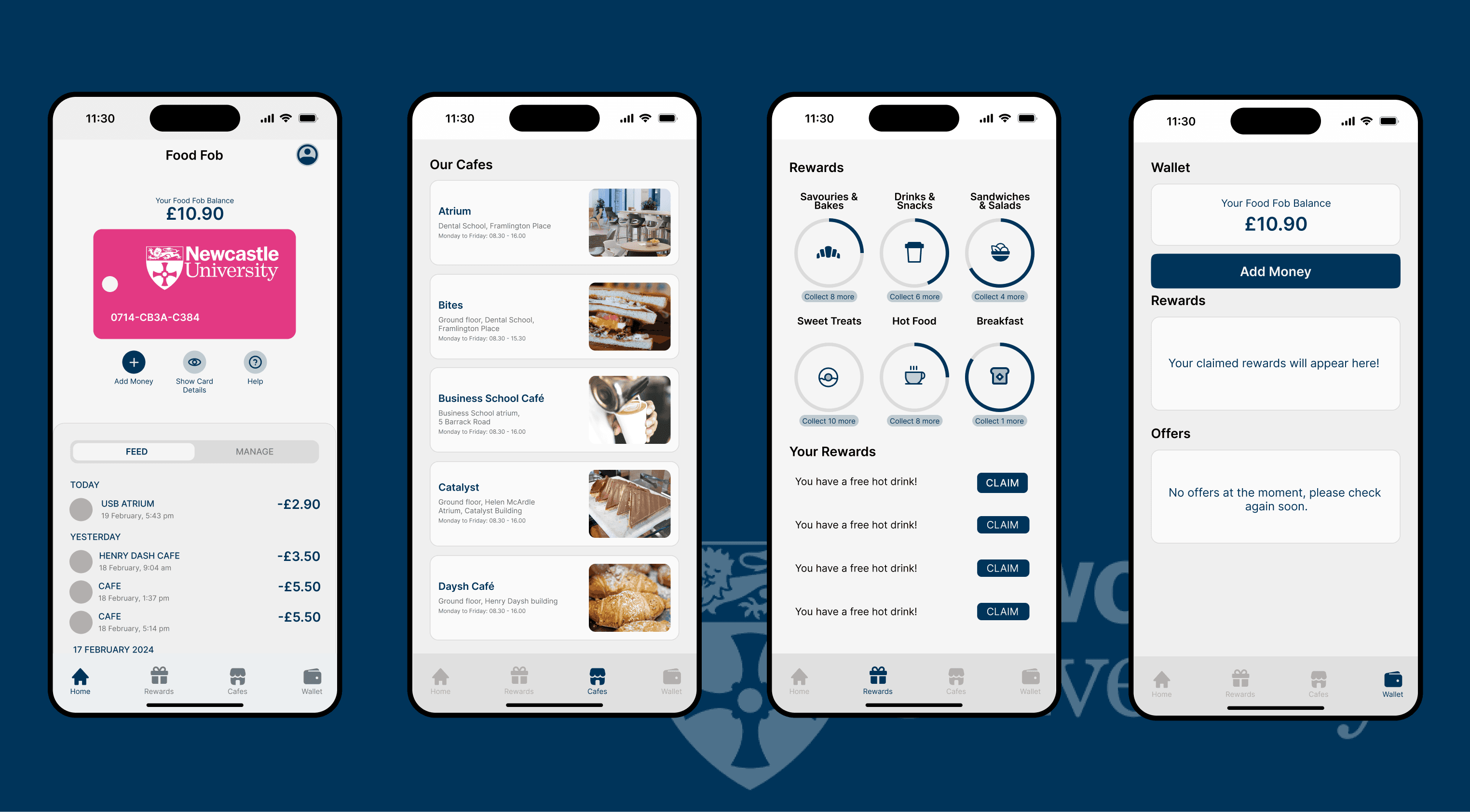
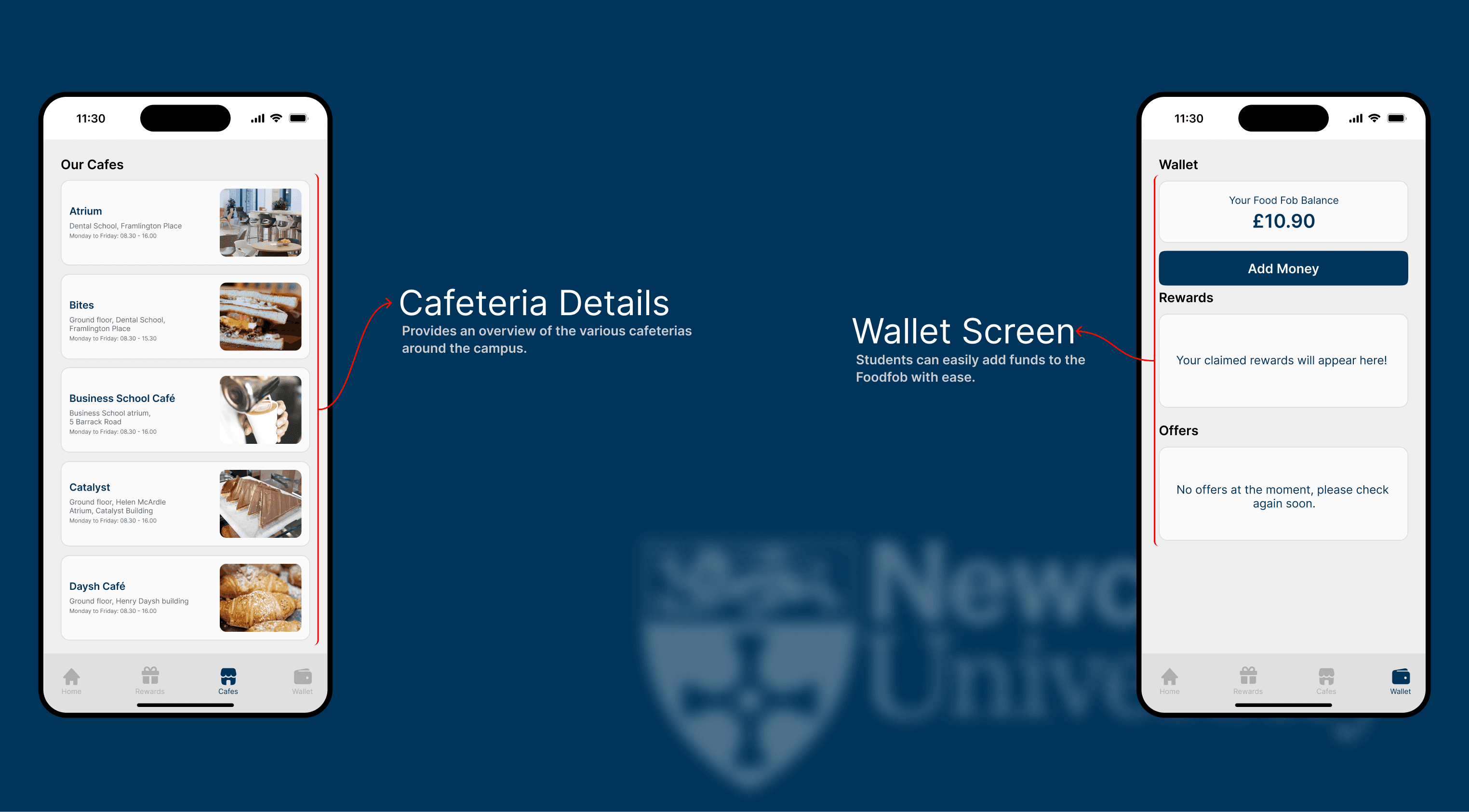
With the flows settled, I designed high-fidelity screens around four core surfaces — Home (balance + transactions), Rewards (progress), Cafés (where to use it), and Wallet (top up, balance, offers).
Testing, then tightening
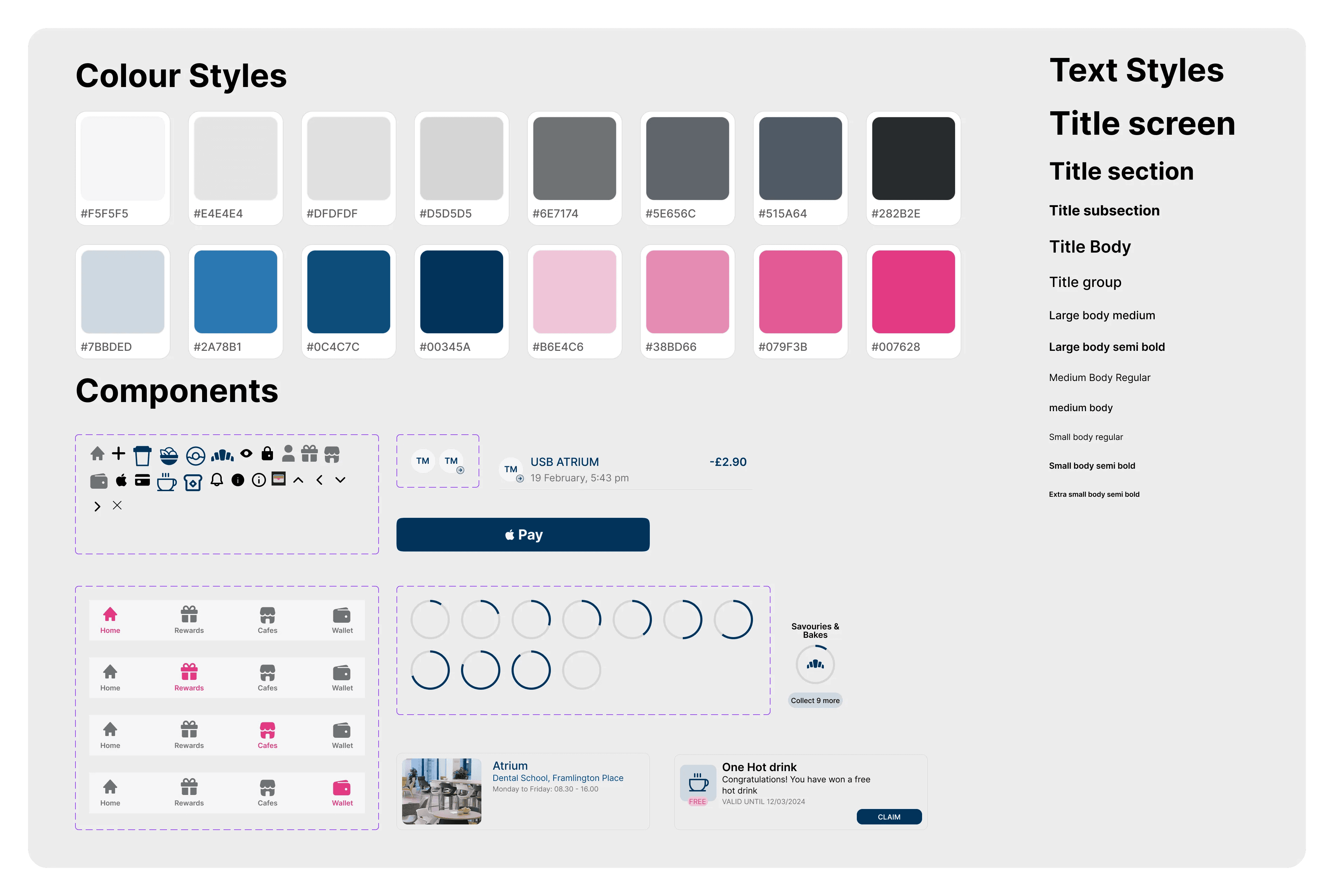
I tested the high-fidelity prototype with students, and their feedback drove a focused round of changes. In parallel I built a small design system using atomic principles — defining components and their properties so the UI stayed consistent as it grew.
What testing changed
- Balance hidden by default. Testers were uneasy seeing their balance the moment the app opened, so the home screen keeps card details hidden until the student chooses to reveal them.
- Add to Apple Wallet. Students expected to carry the FoodFob in Apple Wallet — so the digital card gained an Apple Pay option under “My Card”.
- Reporting a lost card. Testers asked where to report a lost card, so the digital card screen now offers “Request a replacement” and a short “What is a virtual card?” explainer.
- Café cards reoriented. The café photo moved to the left to match natural reading habits and improve legibility.
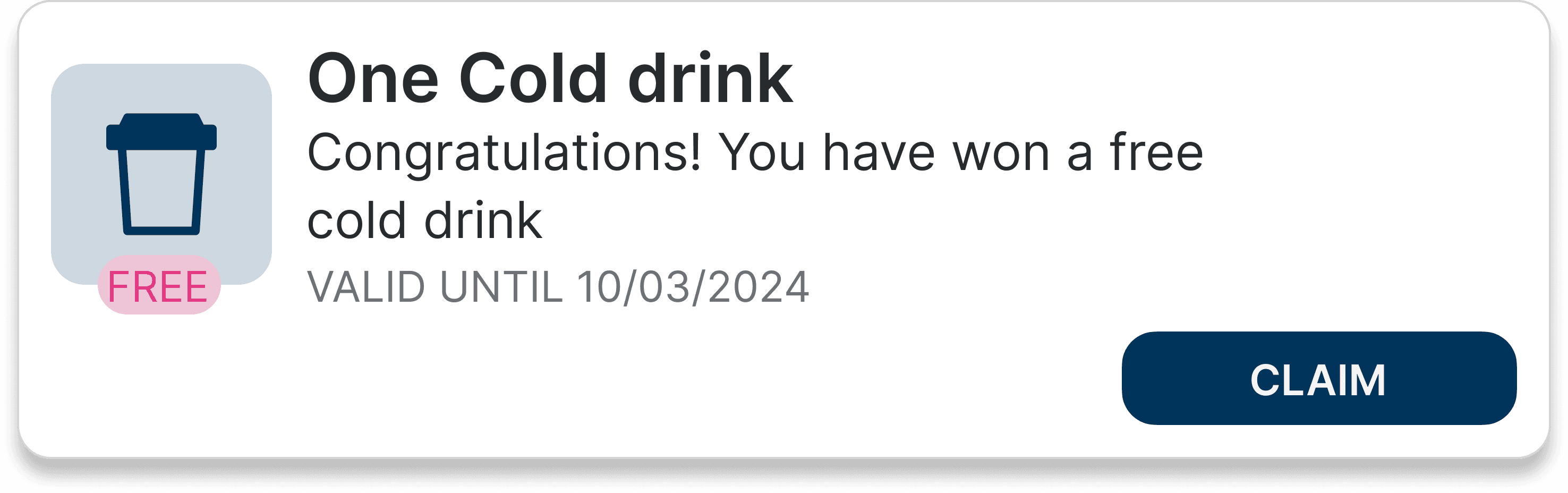
- Rewards moved into Wallet. Available rewards were hard to find, so they now live under Wallet with a clear call-to-action, alongside a monthly spend-and-savings summary.


Where FoodFob could go next
If the app were taken into development, a few directions would extend its value to students and the university:
- Click & Collect. Order and pay ahead, skip the queue, and reclaim time between classes.
- Exclusive campaigns. Student-only discounts and offers personalised to dining habits and preferences.
- Smart inventory. Purchasing patterns inform stock — fresher ingredients, fewer shortages, a more sustainable operation.
Where campus dining actually went
I'll be straight about what this was: a student concept on an eight-week timeline. It was never built, and the value isn't a shipped product. The value is direction — and the direction has since been borne out on campus.
Newcastle University now runs UPAY, the app its catering team rolls out to students. The university describes it as a digital companion for eating on campus — pay across all twelve cafés, 10% off food and drink, loyalty points earned on every purchase, and tailored offers. It's a third-party platform (by Upay / Uniware Systems), not my design — but it lands on the same bets this case study made in 2024.
The same bets, now live on campus
- A mobile companion. The university frames UPAY as a digital companion for eating across all 12 campus cafés — the core move this project proposed.
- The saving, made visible. The 10% per-purchase discount now lives in an app students actually open, instead of sitting invisible on a card.
- Loyalty, built in. Points earned on every purchase and personalised offers — the engagement loop this case study argued was the way to grow daily active users.
- Even the future-scope bets. Order-ahead — the Click & Collect idea from the section above — is part of the UPAY platform.
I'm not claiming credit for an app that already existed and that the university chose independently. What I'll stand behind is the read: in 2024 this project identified the problem, the users, and the direction — and that's the direction campus dining took. For a student concept, being right about where the puck was going is the honest measure of impact.
What it taught me
User-centred design drives adoption
Addressing the pain points from research — visible balance, spending tracking, digital integration — made the tool genuinely more useful. Observing students in both peak and off-peak periods gave a fuller picture of their needs and kept the design honest across contexts.
Integration beats juggling
Pulling card, balance, and rewards into one place removed the friction of separate systems. It cemented a habit of designing unified interfaces that bring related features together rather than scattering them.
Iteration is where it gets good
Moving from low-fidelity to high-fidelity to testing and back surfaced problems I'd never have predicted. Regular testing is now something I build into the process, not bolt on at the end.