QuestFlow
Onboarding a new hospital meant sending them a 250-page PDF and an Excel sheet, then waiting weeks for question-by-question feedback to trickle back. One clinician called it the “PDF from hell.” QuestFlow turns that questionnaire into a clean, reviewable web app — spotted, designed, and built solo into a dev-ready prototype that testers scored 6–7 out of 7 for ease of use.
How a hospital’s questions get built
Ultramed is a UK healthcare-software company. Its products are built on top of a legacy form-builder — think a heavily extended version of Google Forms — that the internal team uses to configure the questionnaires hospitals send their patients before surgery.
The flagship of these is the standard pre-operative questionnaire: roughly 150+ questions across a dozen clinical sections, covering everything from heart and lung history to anaesthetic risk. When a new hospital trust comes on board, one of the first implementation steps is deciding which of those questions to keep, cut, reword, make required, or branch — tailored to how that trust actually operates, without compromising clinical safety.
That tailoring conversation is where the friction lived.
The “PDF from hell”
Because the questions only lived inside the legacy form-builder, the one way to show a trust the full standard questionnaire was to export it — as a ~250-page PDF. It wasn’t a clean document: every page carried the layout scaffolding — section frames, headers, bounding boxes — with the actual questions buried inside. No clinician or implementation lead could comfortably read it, let alone reason about it.
— feedback from a clinical and digital team, and the moment that kicked this project off.
The workflow built around that PDF had quietly accreted for years:
- Send two files. The trust received the 250-page PDF and a separate Excel sheet for logging changes.
- Cross-reference by hand. They’d read the PDF and the Excel side by side — finding a question, copying it across, and writing out the change they wanted and why.
- Route it internally. Account managers passed requests to the two-person form-builder team and head of product; clinical officers then weighed each one against patient risk and clinical safety.
- Email, repeat. What was and wasn’t possible went back to the trust by email — and round it went until the questionnaire was signed off.
The cost showed up everywhere: an unreadable source document, redundant copy-paste steps, and a slow multi-party email loop. The breaking point came as a Slack message — one trust returned over 1,000 change requests in a single pass. One person joked they were drafting their resignation. Filtered down, it was ~400–500 real requests, and the overwhelming majority were the same handful of actions: remove this, edit this, make this required.
If a few actions accounted for most of the work, the review didn’t need a 250-page document and a spreadsheet. It needed the questions themselves, made readable, with the common actions one click away.
A weekend prototype, then a real one
I’m drawn to problems like this — a real, daily pain that a small intervention could lift for a lot of people, while smoothing the path for every future client. So I started building over a weekend rather than writing a proposal.
The first question was how to get the questionnaire out of the legacy tool in a usable shape. I prototyped around a structured CSV, and when I showed the rough cut, our developers confirmed they could reliably export the questionnaires to CSV. That export became the feed for the whole tool: upload a CSV, and the app renders every question — its text and its input type — as a clean, ordered list a non-technical reviewer can actually work through.
Early reactions from account managers, the form-builder team, and the wider group were encouraging enough to keep going and shape it into something real.
Three choices that shaped the tool
QuestFlow grew through a handful of deliberate decisions, each one answering a specific thing the old workflow got wrong.
Make the questions readable first
Turn the most-common actions into one click
Constrain feedback on purpose
One link, the whole review
QuestFlow has two sides: an internal workspace where the team manages master questionnaires and trusts, and a shared review link the trust opens in a browser. No PDF, no Excel, no install.
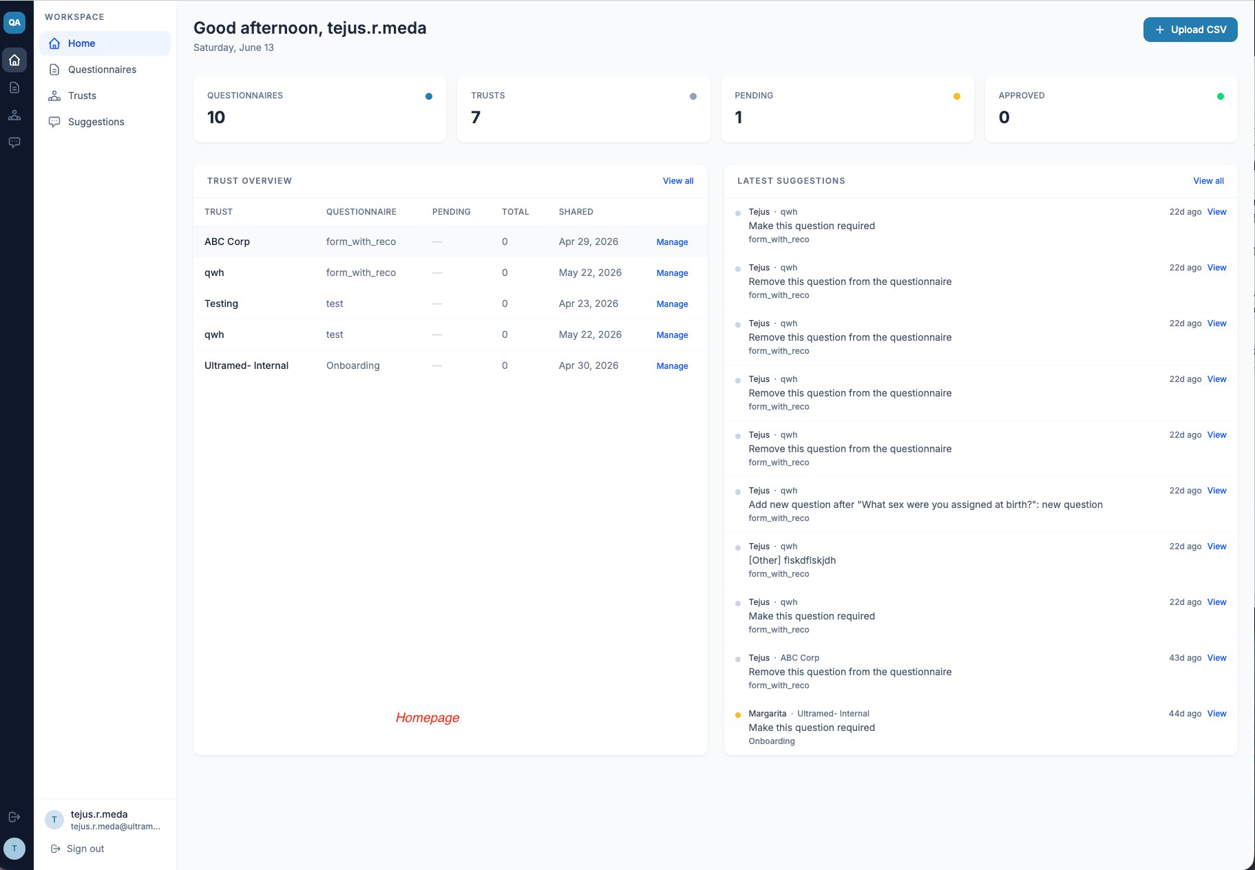
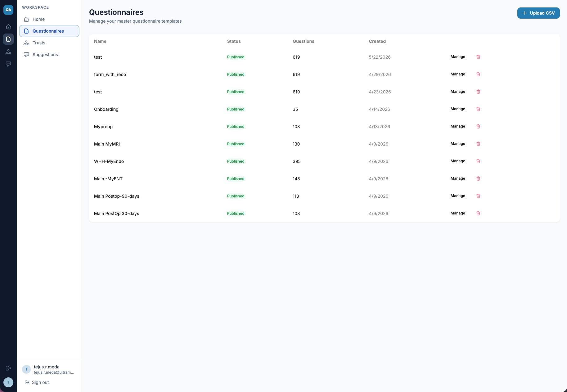
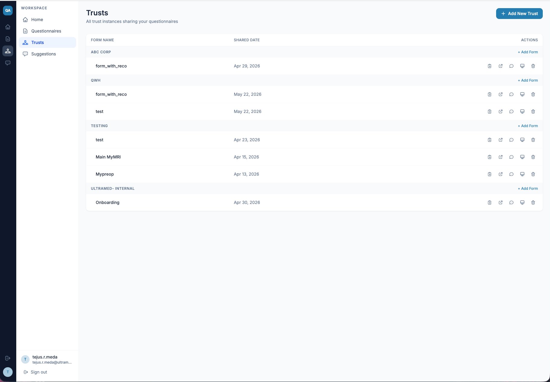
The internal workspace
The team uploads each master questionnaire as a CSV. To start a review, they create a trust, add the people involved (internal or external), choose which forms to share, and copy a link to send over.
The trust’s review experience
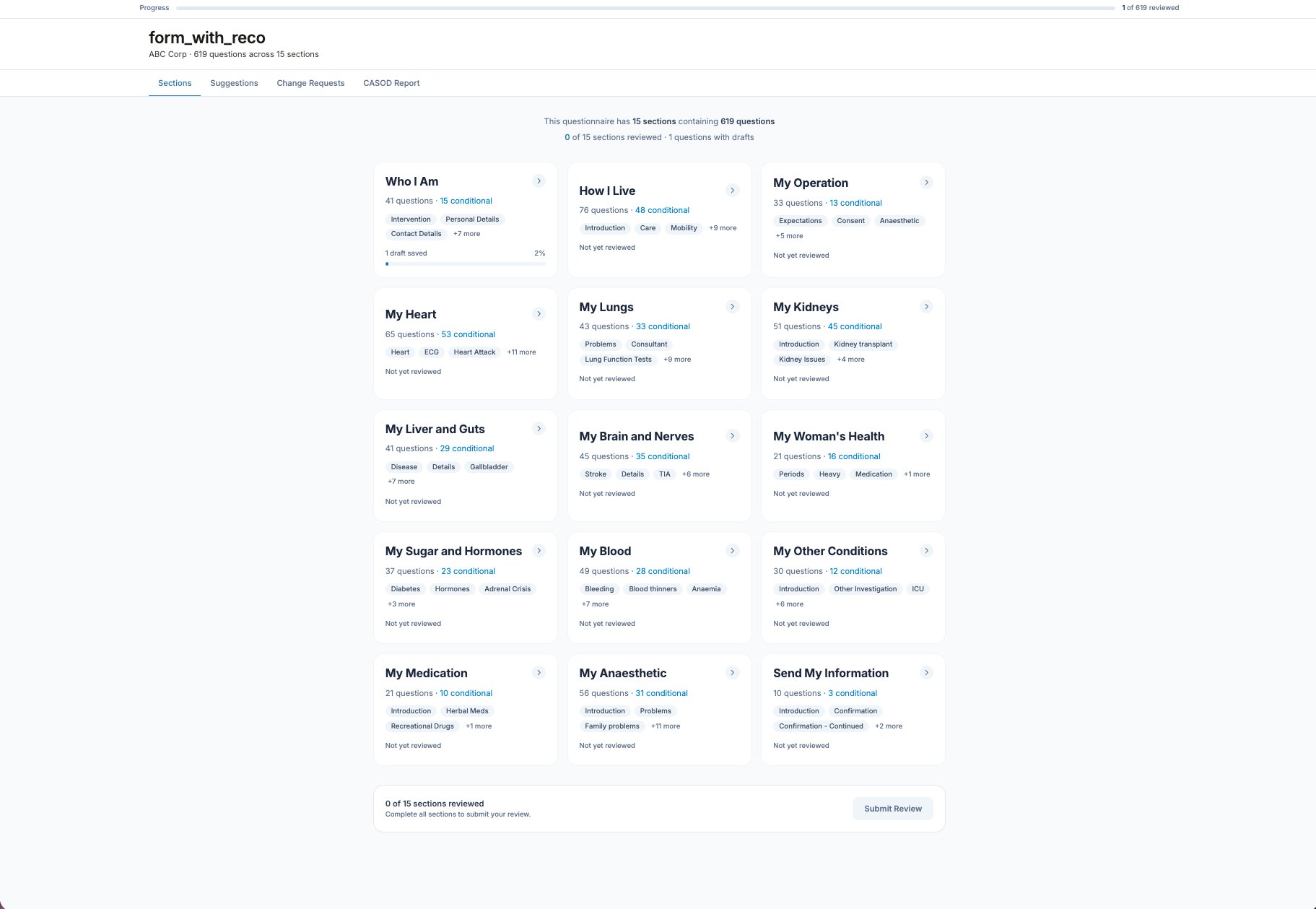
When a reviewer opens the link, they land on the sectioned questionnaire — not a wall of text. Each section card shows its question count, how many are conditional, the topics inside, and whether it’s been reviewed. A progress bar tracks the whole thing, and the review can only be submitted once every section is done.
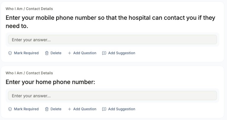
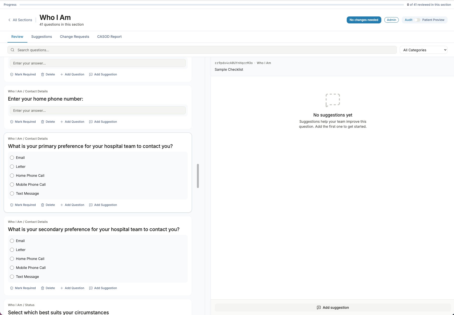
Inside a section, each question is a card with the four direct actions. A reviewer can mark a question required, suggest its removal, propose a new one, or leave a short suggestion — without leaving the page or opening a spreadsheet.
Making the logic legible
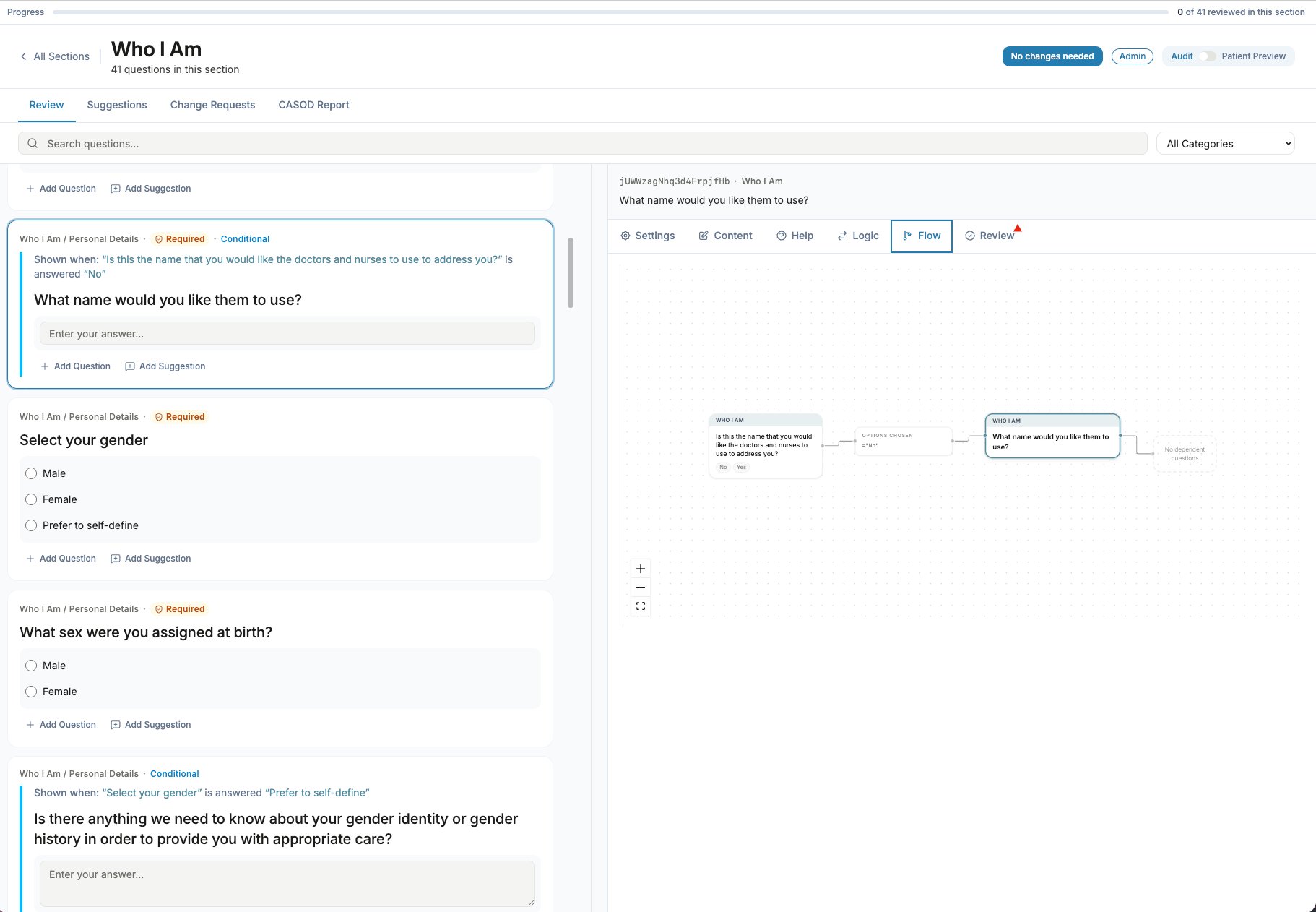
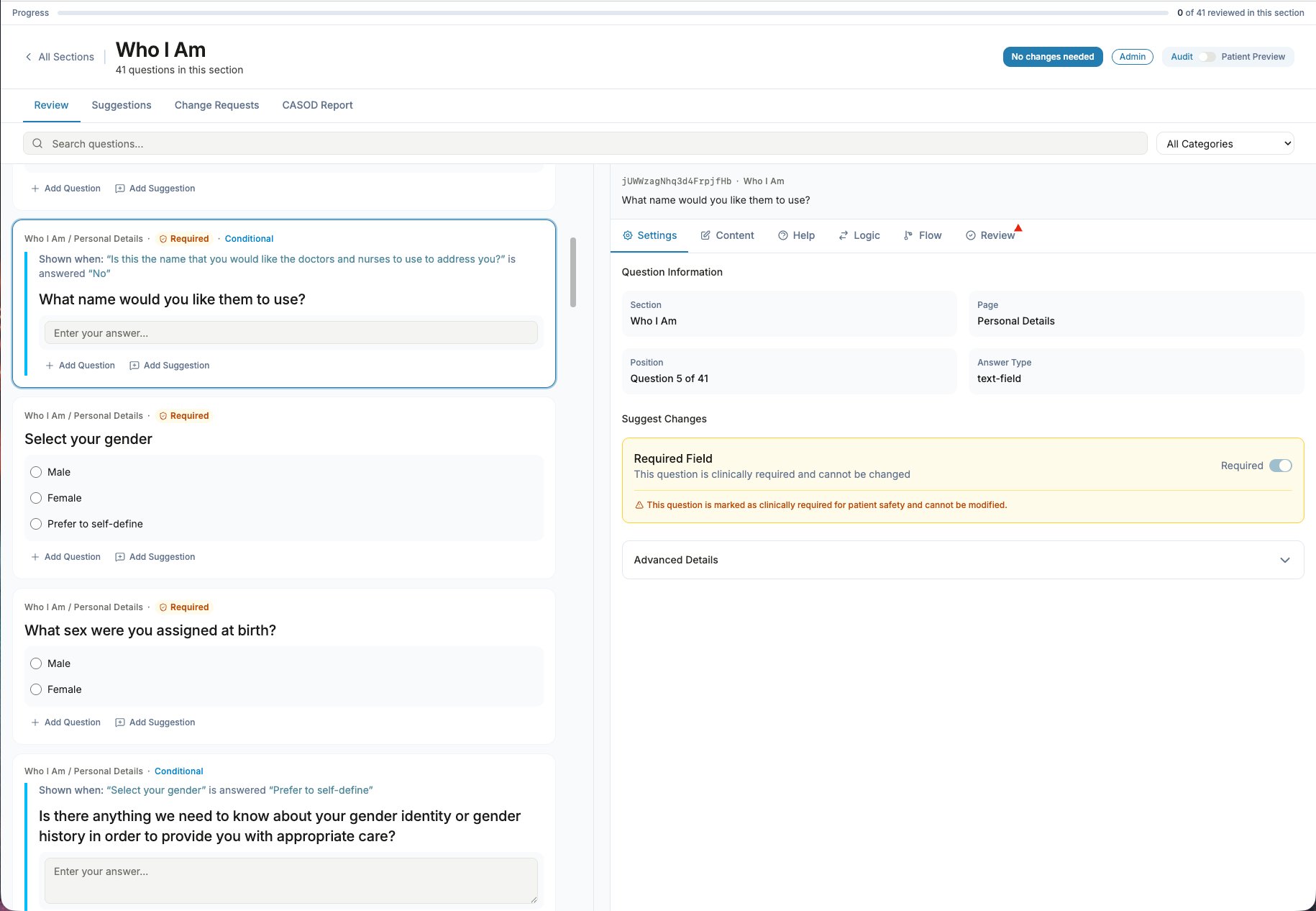
The old PDF buried conditional logic — which question appears when, and off what answer — inside its layout boxes. QuestFlow surfaces it two ways: a plain-language “shown when…” line on each conditional card, and a visual flow graph that traces the dependency from trigger answer to dependent question. It also encodes patient-safety guardrails: questions that are clinically required are locked from edits, with a clear explanation rather than a silent block.
What happened when people used it
I ran moderated sessions on Userlytics with people who review forms in their day jobs — across schools, the civil service, financial services, and corporate ops. To keep client data confidential, I reframed the medical questionnaire as a neutral employee-onboarding form; the interaction being tested was identical.
The headline: reviewers found it easy and fast. Ease-of-use scores landed at 6–7 out of 7, and most reached unprompted for the tools they use today — Microsoft Forms, Google Forms, PDFs full of scattered comments — as the worse comparison.
— events manager, corporate hospitality
- The sectioning was the most-praised idea — one reviewer contrasted it with “reams and reams” of text and said it never felt overwhelming.
- The on-card actions read as intuitive: “it’s all there” — no hunting behind menus.
- “Having all of the suggestions in one place” beat juggling ten reviewers’ emails with conflicting edits — named by a civil-service platform manager.
- Progress tracking and the green section ticks were called a genuine improvement over reviewing a long document “blind.”
- Asked if they’d use it for real work, reviewers said yes — one would “strongly advocate we switch to” it.
More useful than the praise was the friction. A few issues recurred clearly across sessions — and several were worth fixing before going further.
- The right-hand panel didn’t keep pace — after an action it kept showing a different question, so people thought it was broken.
- The Mark Required button gave too little feedback; reviewers clicked twice, unsure it had registered.
- Adding a question offered no input-type choice — people expected to set radio / text / multi-select.
- The conditional “blue bar” indicator was understood only after a beat.
- The “Suggestions” tab was misread as suggestions made to them, not by them.
- Fixed. The panel now follows the question you’re acting on and holds position as you move.
- Addressed. Clearer action-state UI (pending a final code check on my end).
- Rebuilt. Add-question is now an inline flow with input-type choices and above / below placement.
- Queued. A clearer logic indicator — consciously deprioritised as non-blocking.
- Queued. Renaming the tab to reflect “my suggestions.”
One finding pointed straight at the next build: reviewers wanted an audit trail — a deleted or reverted suggestion shouldn’t vanish without a trace, so the team never re-litigates the same change. That, and how suggestions are captured and surfaced back to the internal team, is what I’m working on now.
From prototype to hand-off
QuestFlow is a tested, documented prototype. The load-bearing usability issues are fixed; the rest are triaged and queued rather than forgotten. Right now I’m building the internal side of the review — how suggestions are captured, audited, and presented back to the team that has to act on them.
- Now: suggestion capture, audit trail, and the internal review view.
- Next: developer hand-off — documentation is done — for security, compliance, and a production build.
- Then: a pilot with real trusts before going live.
Built as a Next.js app with Tailwind and shared components; data on Postgres (migrated from a Supabase test setup). AI-assisted throughout — this is also a proof that I can take a problem from spotting it to a working, tested build, not just a Figma file.
What I took from this
The best briefs aren’t handed to you
Nobody asked me to fix the PDF. A throwaway line of frustration was the brief — and acting on it, rather than waiting for permission, is what made it real.
Let the data shape the interface
The 1,000-request incident wasn’t just a horror story; it was a frequency analysis. The most-common actions became the primary UI, which is why reviewers found it intuitive without being taught.
Constraints can be a feature
Leadership’s “more control invites more work” concern pushed me toward deliberately limiting feedback. Knowing what not to let users do mattered as much as the features I added — and it’s a line I’m still tuning.
Testing earns its keep in the friction
The warm scores were reassuring, but the value was in the snags — the panel that lost focus, the button that gave no feedback. Those findings, not the praise, are what shipped next.