Case study / Self-initiated internal tool
Turning a 250 page PDF into a review clinicians can actually finish
Three disconnected files, one workspace, and a weekend prototype that engineering is now building on.
Reviewing one questionnaire was exhausting a trust before they had even gone live.
Clinical teams had to work through 150+ questions in a 250 page PDF, log every change by hand in a separate spreadsheet, and check a third preview link to see what patients would get. One trust returned around 1,000 change requests for a single form. Roughly half were duplicates.
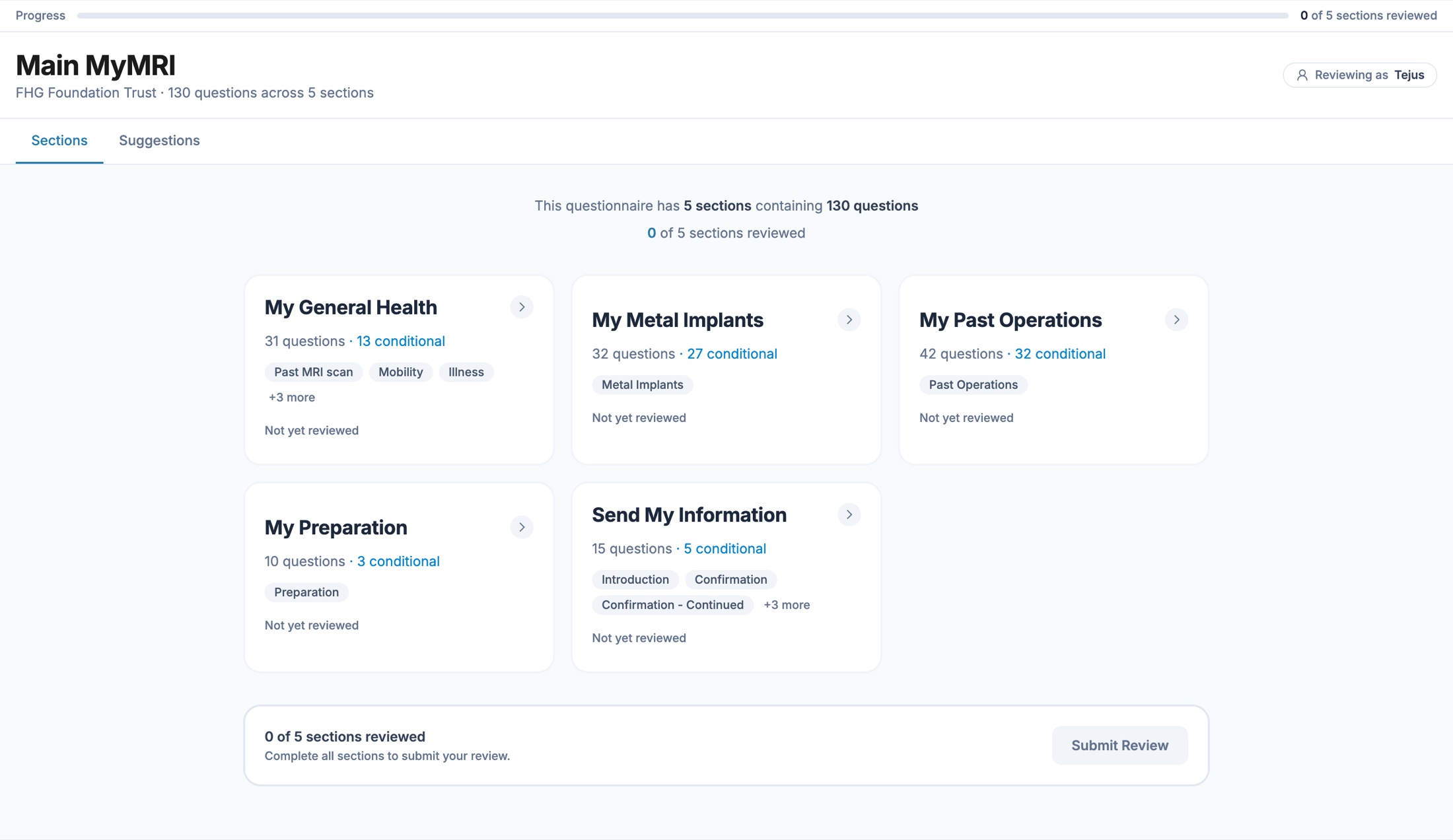
One workspace, tested at 6.5 out of 7, now being productised by engineering.
A weekend prototype replaced all three artefacts with a single reviewable question list. It was adopted as a proof of concept, made a company objective, and handed to the engineering team as a working codebase rather than a spec.
01 / Problem
Before a trust can go live, clinicians have to review 150+ questions across three files that do not talk to each other.
Every hospital trust customises the standard pre-operative questionnaire before launch: keep, remove or add questions, and confirm the conditional logic behaves the way their pathway expects. It is one of the first hands-on experiences a trust has with us.
That review was running across three disconnected artefacts:
- A 250 page PDF exported from a legacy form builder, poorly formatted and near impossible to scan
- A preview link showing what the patient would eventually see
- An Excel sheet where every requested change had to be logged by hand
The PDF from hell. I would do anything to spare another team from this. Clinician, onboarding trust
What it actually cost
- Delayed onboarding. Clinicians with full lists were asked to spend hours transcribing decisions into a spreadsheet
- Noise instead of signal. One trust returned around 1,000 change requests for a single form. After filtering, roughly 500 were real
- Email churn. The PDF never showed what a question did downstream, so account managers fielded long clarification threads
- Commercial risk. A trust became reluctant to expand with us, citing the effort of getting one questionnaire through review
02 / Context
Nobody assigned this. I heard it in an all-hands and built something over the weekend instead of writing a proposal.
The feedback came up in passing when an account manager relayed it to the wider team. It sat outside my remit: the form builder was legacy backend, onboarding belonged to implementation, and there was no ticket for any of it.
So rather than argue for the work, I made something people could open.
The constraint I set myself: no change to the legacy form builder. Whatever I built had to consume what already existed, so adoption would never depend on a backend rewrite.
03 / Approach
The PDF treated a question as a line of text. It is closer to a small system.
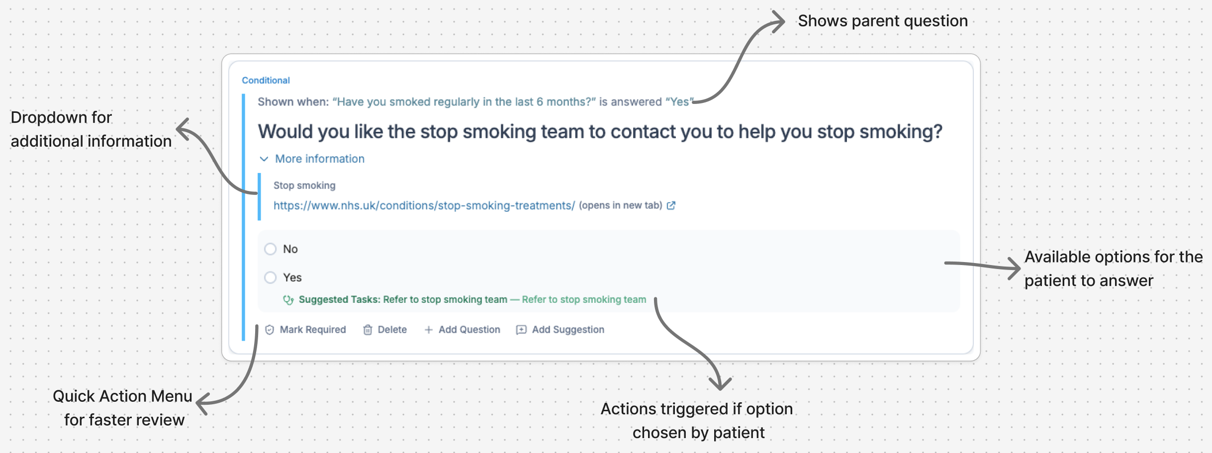
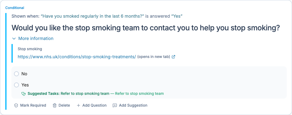
A question can raise a clinical flag, trigger a system action, open a conditional branch, or carry patient-facing content, none of it visible in the export. That's why reviewers kept emailing to ask what a question did. The fix was to stop showing questions as text and start showing them as objects with their behaviour attached.
I built the prototype as a working tool in Claude Code, not a Figma flow, parsing the real CSV export so it had to survive messy real questions and stakeholders could use it instead of imagining it. And because clinicians needed low-effort review while account managers and form builders needed clean, de-duplicated output, most of the decisions here were about serving both without favouring either.
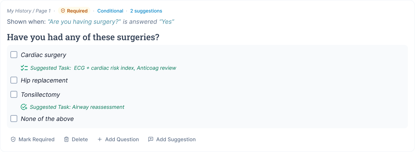
Anatomy of a question
Everything below the answer options was invisible in the PDF. Surfacing it is what removed most of the clarification emails.
Why this mattered
A clinician deleting this question in the PDF couldn't see it was also removing an ECG trigger and a report flag: the delete looked free. Showing that behaviour on the card turned deletion into an informed decision, and made the returned change requests safer for our clinical team to sign off.
Four versions, before it stuck
Built in code, so each version was tested against the real questionnaire, not a sample.
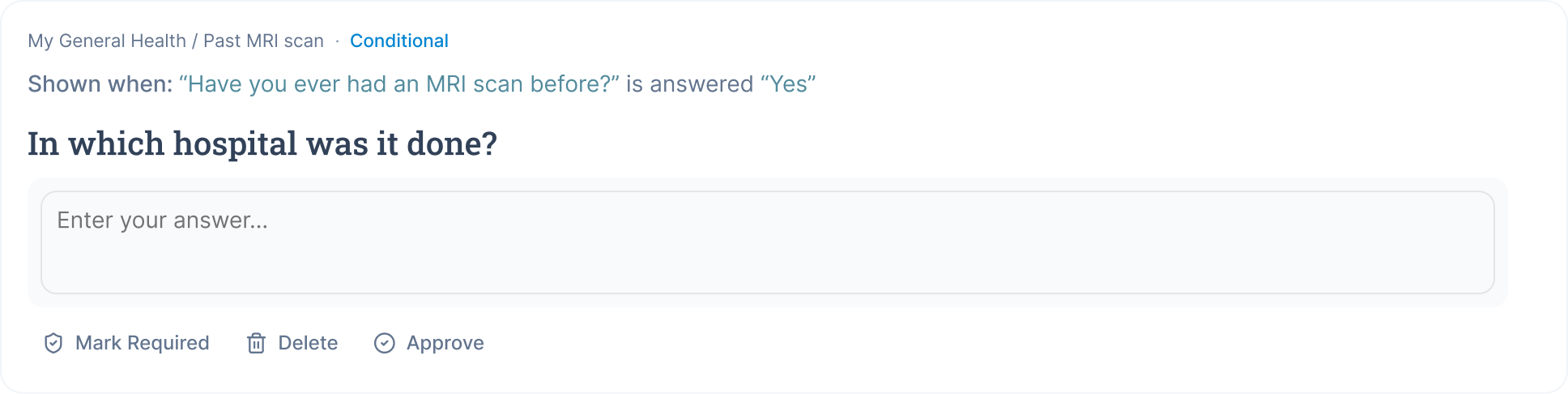
The bare MVP
- Section, question type, and the characteristic tied to each option — nothing else
- Built before any clinician or trust had a version to react to
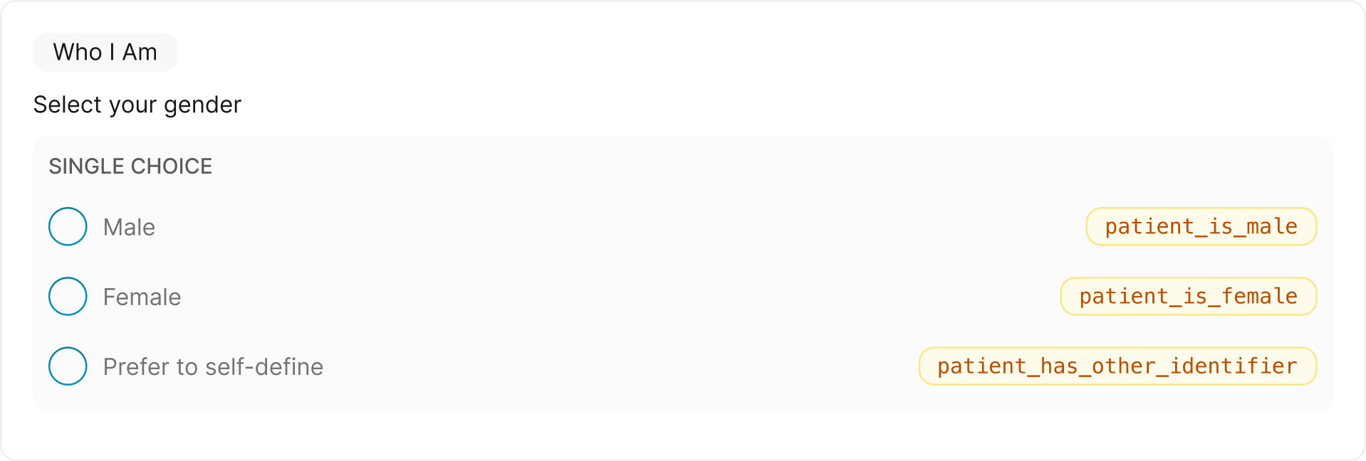
Quick actions arrive
- Section, page, and conditional trigger logic now shown on the card
- Bolder question text to stand out from the metadata
- Three quick actions added: Mark as required, Delete, Approve
Everything, all at once
- Badges, suggestion count, and suggested tasks added
- Approve removed — questions assumed approved unless flagged
- Add question and Add suggestion replaced Approve in the action bar
Stripped back to what mattered
- Removed everything Version 03 said twice: conditional status became a single badge top-left, required became a small marker in the question text itself
- Same information as Version 03, without repeating it across the card
What I built, and what I left out
The prototype existed to earn a decision, not to be complete.
In the weekend build
- 01CSV import. No backend work, no dependency on anyone else.
- 02Question cards with behaviour attached. The entire argument for the tool.
- 03Quick actions with a reason. What replaces the spreadsheet.
- 04Export in the existing format. The receiving team changes nothing.
Deliberately not yet
- 05Real-time collaboration. Would've made it a build project, not a demo.
- 06Auth and permissions. Needed for production, not for proving the concept.
- 07Editing the questionnaire itself. Clinical sign-off stays with our clinical team.
- 08Polish beyond the card. Spent the time on the screen the argument rested on.
04 / Solution
Three artefacts collapsed into one workspace, with the review decision captured where the question is.
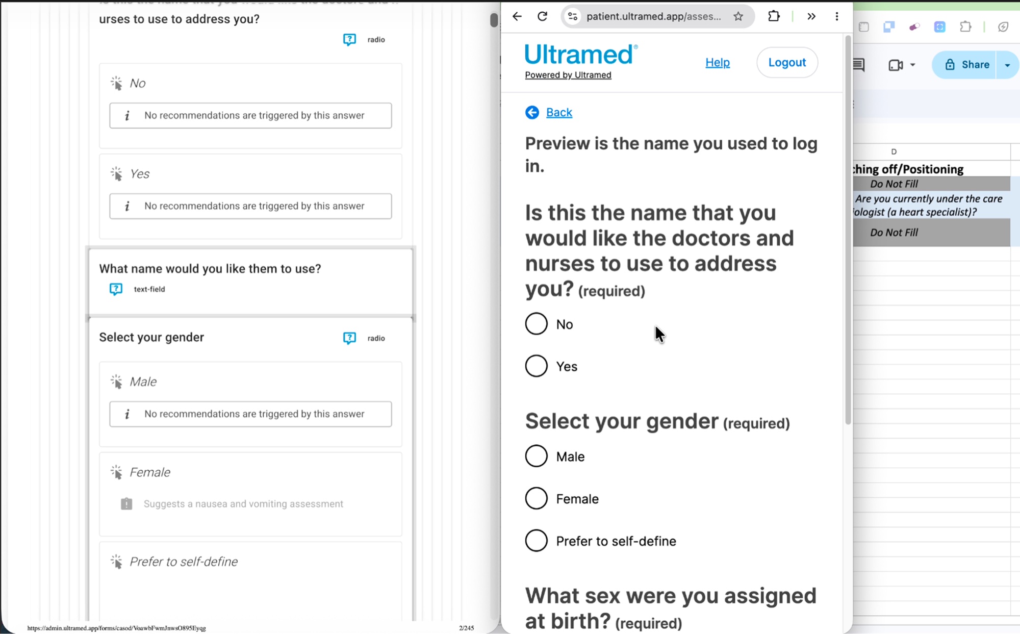
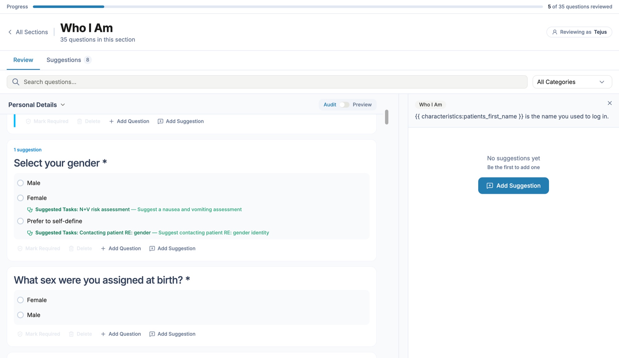
The same section of the same questionnaire, before and after. Drag to compare.
Question list and card view
Every question is navigable from a single list, with a card exposing the options, characteristics, logic and linked content the PDF hid.
Quick actions in place
Delete, mark required, add a question, add a suggestion. The decision is recorded on the question itself rather than retyped into a spreadsheet.
Export in the format the team already uses
The clinical team downloads the CASOD sheet the form builders work from, which removes the manual transcription step and the duplicates it produced.
One shared source per trust
Account managers and form builders maintain questionnaire versions in one place and share them with each incoming trust, so review stops happening across email.
05 / Where it landed
Tested well, adopted as a proof of concept, now being productised by engineering.
The team estimates the review cycle can be cut by more than half. That is an internal projection rather than a measured result: the tool has not yet been through a full onboarding cycle with a live trust.
06 / What it changed beyond the tool
The bigger shift was how design hands work over.
Handover became a running build
Engineering picked up a working codebase rather than a Figma file, so behaviour and interaction were demonstrable instead of described.
A shared vocabulary for questions
Naming the layers of a question gave clinical, account management and engineering the same words for what a change request actually touches.
A route for unassigned problems
Building first and asking second turned out to be a faster way to test whether a problem was worth company time.
07 / Reflection
The strongest signal in this project was a throwaway quote in a meeting.
Qualitative signal beats a ticket
"The PDF from hell" was not in a research report. Deciding it was worth acting on before anyone asked me to was most of the work.
Building changed the design
Nested logic and the pull between clinician and account manager needs would both have been handoff surprises in a Figma-only process. In code they were design problems.
Instrument first
I would measure the review cycle before the tool went live, so the improvement could be reported rather than estimated. I would also test with clinicians across more trusts, since customisation appetite varies widely.
The real test has not happened
Whether the 500 genuine change requests become clearer and fewer, and whether the review that exhausted one trust becomes something the next one barely notices.